table turning
We’re usually pretty good at finding design solutions, but we’ve struggled to solve our living/dining room conundrum. At around 24 x 13 feet, it’s plenty big enough (huge by our UK standards) but it’s tricky to arrange everything in a functional way, as I’ll try to explain.
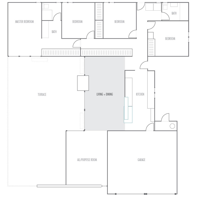
This space is divided from the kitchen by a three-quarter height wall. Many people remove this, to create a combined ‘great room’ –for living, kitchen and dining. I understand why, but we like the separation. This wall also screens the front entrance, and provides an ideal sofa backdrop. With a fireplace opposite, this is a natural fit for the living room –surely its intended use.
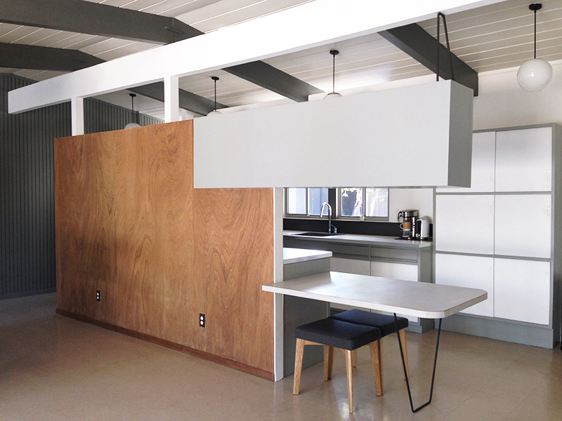
That leaves the other end for dining…and that’s where things get tricky. Problem is, the hairpin table is in the way (excuse the evening snap –all I could find). Move the table too close, it’s awkward. Too far right, it blocks the all-purpose room. Either way, it doesn’t feel right having two tables in such close proximity.
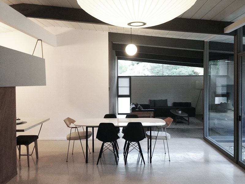
We could use the hairpin table for dining, as we have for two years, but it’s just not practical. It makes a great breakfast bar or serving area, but it doesn’t work for dining. Too small. Too low. Too awkward. I’ve lost count of the times I’ve banged my head on the overhead cabinet.
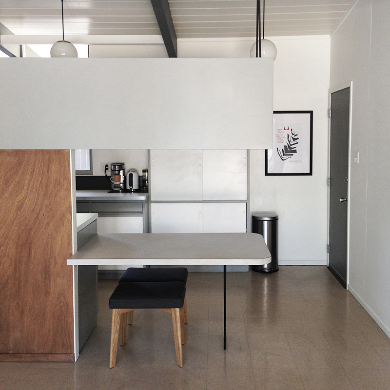
On that, this cabinet (AKA ‘flying coffin’) is a defining feature of our model. We love how it looks, but it’s not without issues, in addition to being a head-height hazard.
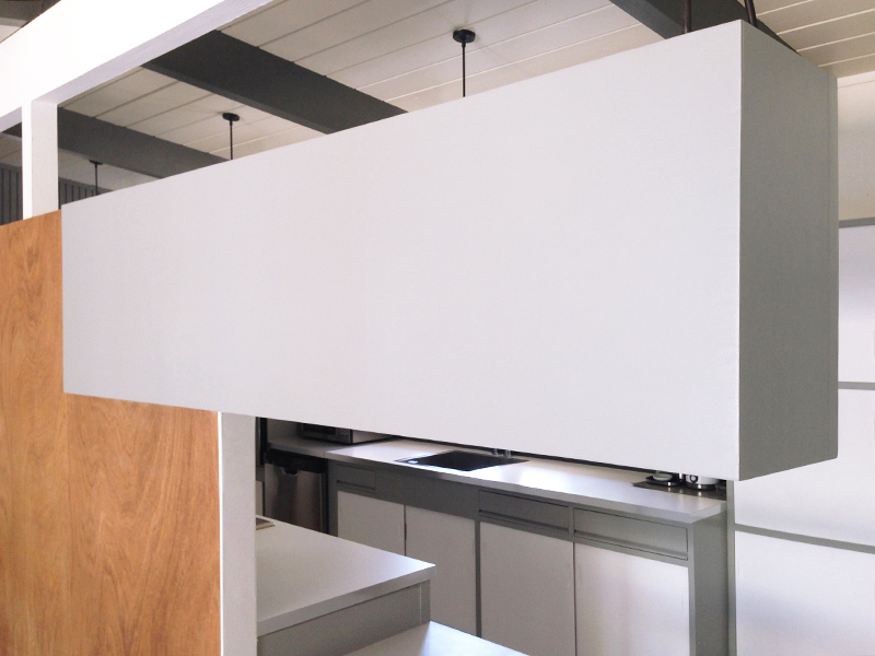
It blocks the view from kitchen to patio, while reducing light. It’s also in poor shape (warped and tilted) as you’d expect for a 60-year-old cabinet. That said, we’ve grown extremely attached to it.
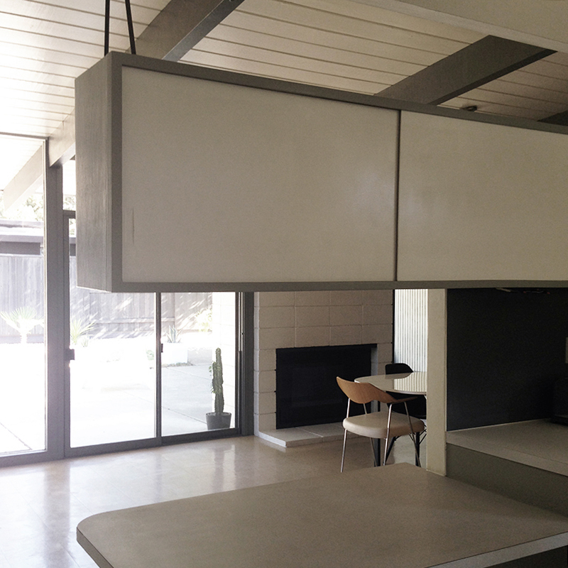
Karen recognized our issues early on, reaching a logical conclusion –the coffin and table should go. I wouldn’t hear of it. Two years’ on, we were no further forward. But we agreed on one thing –we both wanted a dining table. We found a cheap IKEA solution, and put this in the living room.
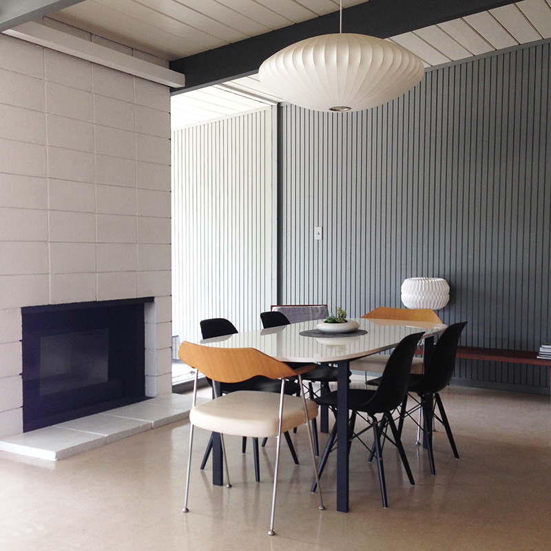
The top is very much our style –white, glossy, low-profile. The legs were simply the least offensive we found. We sprayed them from white to black and added four knock-off DSWs, plus our Robin Day 675s at either end. We like the look, but it eats too much space. No room for a second seating area.
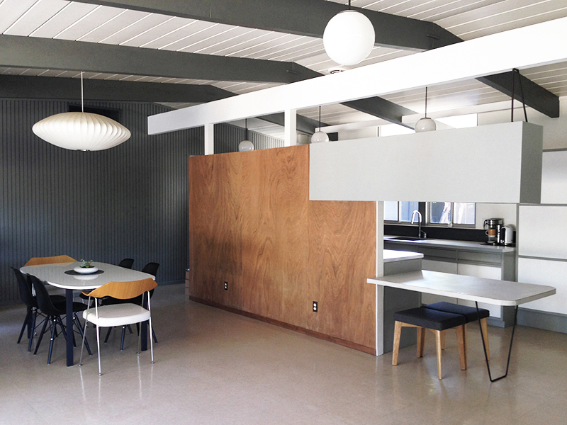
Something had to give. We revisited our discussions and (eventually) agreed a way forward. As I’m sure you’ve guessed by now, we decided to remove the flying coffin cabinet and hairpin table. Gasp! This was a two-phase process, starting with the table (easily removed/replaced) to check how things would fit.
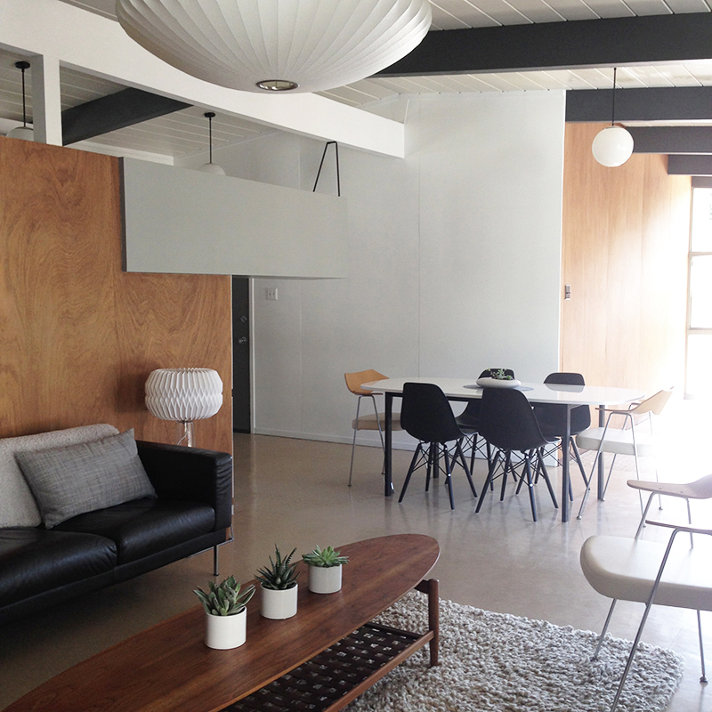
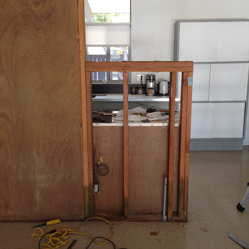
Very well. Plenty of room for the dining table, and the flow was good between kitchen, dining and living room (set up using our TV room furniture). We pressed on, and removed the flying coffin. It’s built into the wall, meaning it leaves a corner gap, requiring rebuilding.
Quick (related) aside –while deliberating, we scoured sold listings for pics of our model, curious to see how people handled the living/dining conundrum. Most had removed the wall. Those that kept it removed the cabinet and table. Amusingly (to us) some people didn’t rebuild the wall.
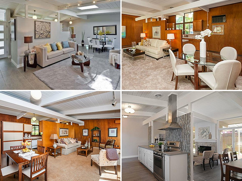
This leaves a flying coffin-shaped gap –shown naked (top-left) or dressed with plants (top-right). Use what you’ve got, I guess. The other two examples were rebuilt square, though one owner (bottom-right) couldn’t resist creating a serving hatch. Fancy. We wouldn’t be taking this route.
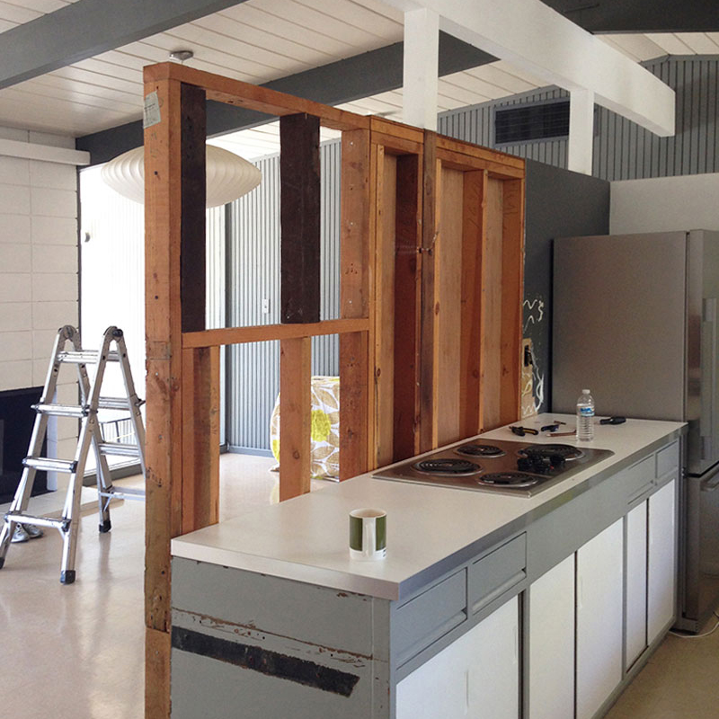
We tapped into our garage wood pile and extended the wall upwards, to make it square –it won’t win design awards, but it’s sturdy and straight. Karen re-wired the electrical, and added an outlet within our kitchen cupboard, to enable low-level lighting. Then we patched the kitchen side.
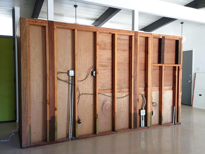
We insulated, figuring this would reduce fire risk and dull kitchen noise a little. While we were at it, we refinished the paneling –it’s tricky to remove all the paint while the panels are still attached, so this was a bonus. I won’t bore you with details, but it turned out great.
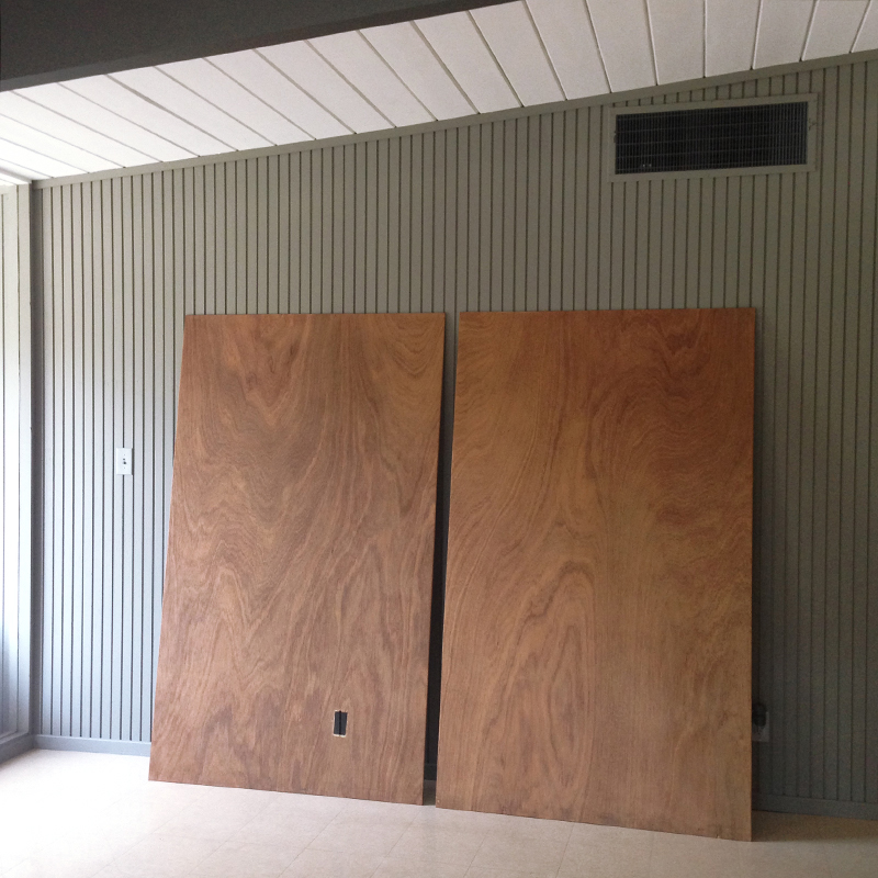
We re-attached these two panels, then made a third piece to fit, using left-over paneling from our all-purpose room project. It took some experimentation to match the wood color (likely from a different batch) but it blends just fine, and should mellow over time.
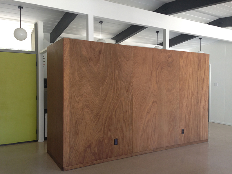
We re-attached the baseboard, and finished things off with original brown bakelite outlet covers, via eBay.
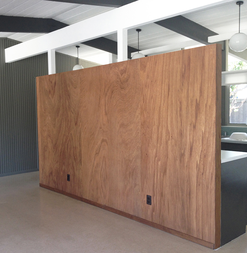
We used more left-over paneling to create a narrow end strip (where the hairpin table used to be). We stained some new quarter-round to finish the edges, as per our other original walls. Fiddly work, but it turned out well.
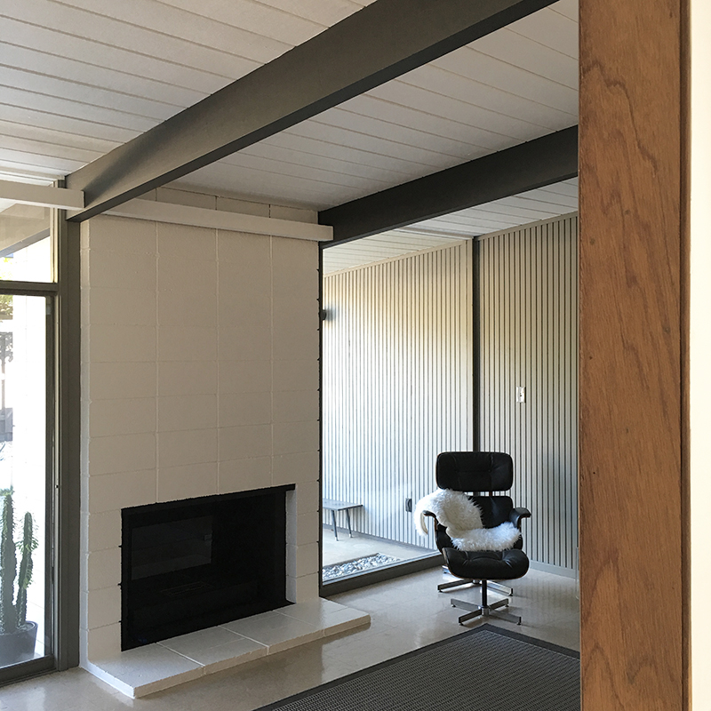
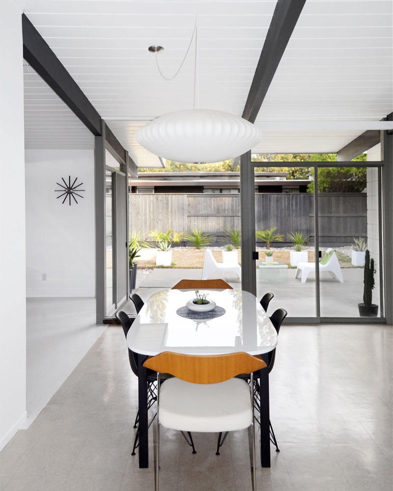
Time to set up the room. We centered the table on the white/wood corner of the all-purpose room wall, and in the gap between this and the kitchen wall. We had some issues with the DSW bases, so the manufacturer offered these Eiffel/wire replacements. We prefer them, so that worked out perfectly.
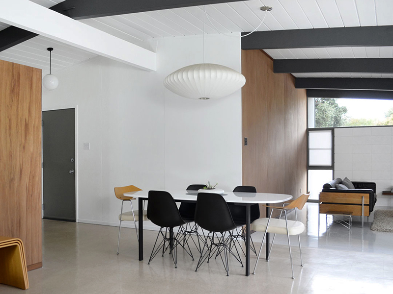
We also relocated our Nelson Saucer (from the living room) to this spot. New table placement meant ordering more cord (from Modernica) so we could swag the light, using an ‘s-hook’. There was a globe light here, which we plan on shifting to the other (vacant) end of the room.
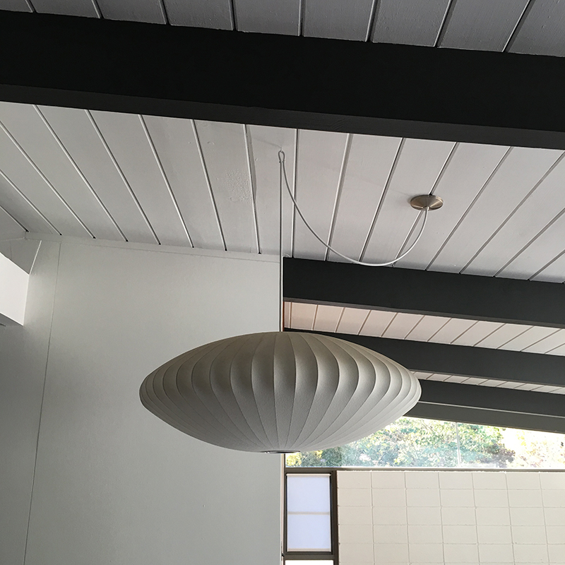
Our living room is far from final –the day-bed is a temporary sofa, the credenza technically a dresser, and the rug bought for our patio. I’d like a coffee table and side chair, but Karen fears cluttering. Despite the eclectic mix, we’ve used this room plenty, and the dining table most nights. We’ll keep the table-top long term, but switch the legs for a custom walnut base. And we’ll shift these chairs outside, replacing them with genuine shells –on our ever-growing list.
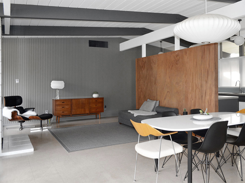
We’ve also gained this view to the patio, extra light from both directions, and improved access/flow from the kitchen. On the downside, it emphasizes our need to finish landscaping. In so many ways, this is proving a positive change for us. Don’t get me wrong, we had huge guilt pangs before, during and after this change, and I’ve dreaded the reveal ever since. But it feels right.
In our opinion, models of our era are far from perfect, and many earlier Eichlers are unrecognizable as such. Eichler’s architects acknowledged early flaws, refining details over time. It still pains us to sacrifice original details but, after living here for two years, we feel justified in making some tweaks. And we’ll use the flying coffin elsewhere, as per many other (guilty) Eichler owners.

Brooke
I think it looks pretty darn nice. The effort you guys put in to keep as original as possible is impressive but I don’t think anyone can fault you for making an improvement based on how you use the house in this era. Unlike some of the example photos yours looks like it has always been that way. The room will look spectacular once you get the furniture you want and the new floor!
fogmodern
Thanks Brooke! We struggled with this decision, and I’ve been nervous about revealing it, so I really appreciate your kind words. We are definitely looking forward to finishing the flooring and adding furniture. For now though, the space is working so much better for us. And that alone makes it worthwhile.
Karolina
That’s a very tidy and respectful modification– I think you guys made the right call. Really well done. The openness of that dining room view to the yard is fabulous. And I love the grain of those wood panels, but now I’m dying to see what’s doing on in the kitchen on the other side!
fogmodern
Thanks Karolina! So pleased you think this was the right call –it really was a tough one. Gaining that view is a big bonus. We have been busy in the kitchen, but nothing too radical. Should get round to sharing the details later this month.
tony
Hi Andy. I agree with Brooke and Karolina. You have made the right call. I know you try like mad to respect the original features of the design, but after all you are living in your HOME and not just a HOUSE so it has to be practical. What you have removed is not the best of Eichler features, and by taking it out you have opened up the interior in such a way that other features can be more appreciated. Your view into the garden from your dining area is a great example. You have also improved safety, so no more “head bashing” on the flying coffin. You have ended up with a more open feel to the whole area. You are to be applauded for your bold step – undoubtedly the right decision. Keep up the good work.
fogmodern
Hi Tony! Thanks for your kind and considered words. While it IS our home, we’re also custodians of this great piece of architecture. We need to live comfortably, but we don’t want to change things beyond recognition. It’s a balancing act. Hopefully we’ve retained enough ‘Eichler’ while making the home more livable for us and future owners. I don’t see any big changes ahead, so we can take a deep breath for now!
John
Much better! The insulation won’t help with fire resistance though. Any plans for a cool wall picture or shelves?
fogmodern
Thanks John, glad you approve! We thought removing the cavity inside the wall would slow down fire –oh well, guess it can’t hurt anyhow. We won’t be adding anything to the wood wall (we love how it looks plain) but the white wall needs something, for sure. We’re working on it.
John
Wall cavities between floors in commercial buildings require firestopping to prevent fires from spreading. This was a problem in old houses that had balloon framing where the outside stud walls ran from the ground floor to the roof in a two story building and fire could travel up the cavity. I first thought you might just replace the coffin cabinet doors and back with glass.
fogmodern
Interesting –thanks for the lesson, John! We did consider glass, but it seemed more hassle than it was worth, and would likely have looked even less original. In any case, the hairpin table was the main issue –with that gone, we couldn’t keep the cabinet, for safety reasons.
Pingback: art work | fogmodern
Melissa Arnold
Andy,
I love reading your blog and your house is amazing! We just bought an equally amazing (especially for our area where mid century modern gets trashed all the time!) mid century home that has paneling throughout and I’m curious how thick your paneling is. Can you show me what it looks like from the back and the “cross section”? If you’re interested in seeing one of the really great examples of mid century modern in Louisiana, this is the link to our new home’s MLS listing http://www.realtor.com/realestateandhomes-detail/114-Elm-Dr_Hammond_LA_70401_M82041-19866. Thanks, Melissa
fogmodern
Hi Melissa! So pleased you enjoy the blog, and our house! Oh wow, your place is AMAZING –congratulations! Thanks so much for sharing. I’ll need to check on our paneling. Would you mind dropping me an email (andy@fogmodern.com) and I’ll get a pic to you next week, when I have a little more time. Thanks again!
Pingback: cabinet reshuffle | fogmodern