open house (part one)
People say you should live with your home a while, before making major changes. Good advice. And advice we’ve taken, having lived here almost two years (I know, time does fly). Truthfully, I didn’t think we’d ever make significant changes. But that’s about to…er change. And this is where it’s happening.
Our living room (LR, below) is pretty dark –this, despite a wall of windows, overlooking our terrace (T). Problem is, those windows face north. There’s a half wall fronting our kitchen (K) to the south, and a full wall to the east. To the west is our all-purpose room (AP), divided by another wall, marked in red…ominously.
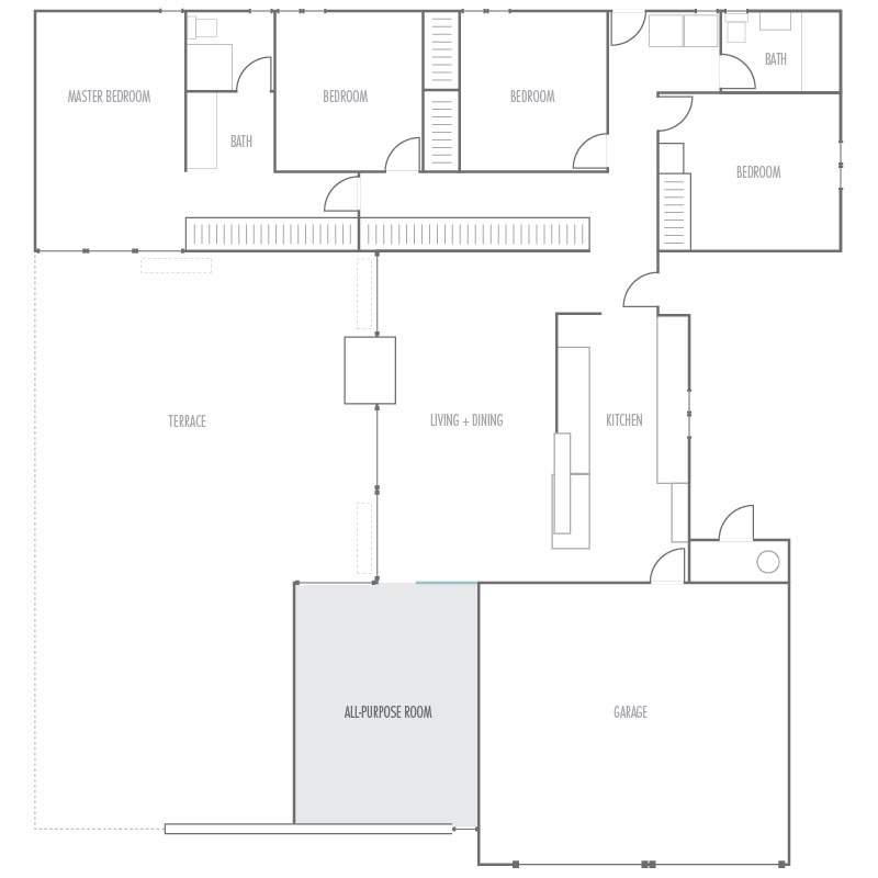
The AP room gets a little morning sun, and plenty of afternoon sun, through large wedge-shaped clerestory windows. But the only light path to our living room is through a door-width opening. The rest is blocked by the wall. Separation is clearly intentional, and we like how it looks, architecturally, but it just doesn’t work for our home’s orientation.
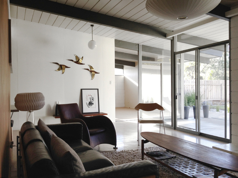
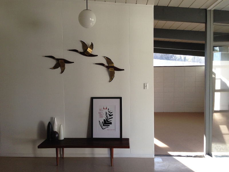
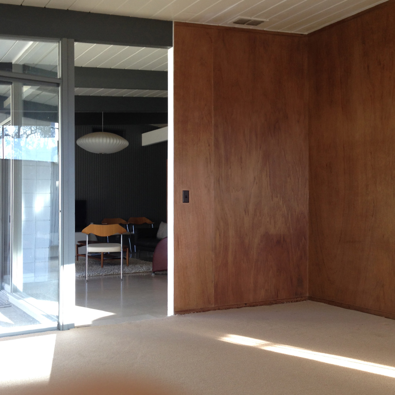
You can see where I’m going with this, right? We decided to remove this wall, up to the left-hand duck (above). FYI: no ducks were harmed in the removal of this wall…though they have been re-homed. Here’s a look from the other side. Incidentally, the ill-fated wall is wider than it appears in the plan.
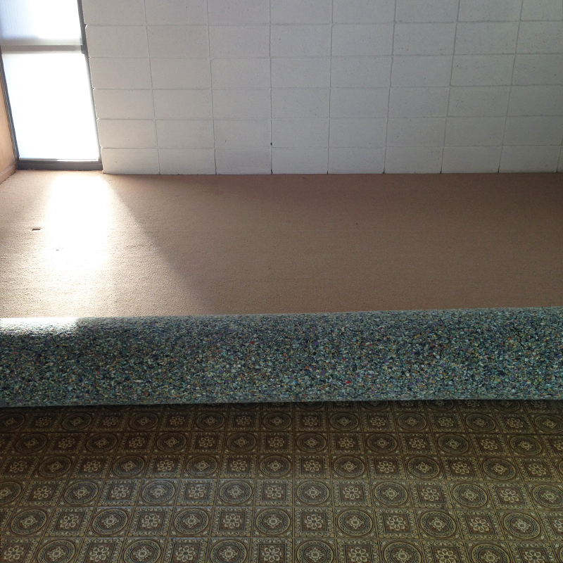
Still not a big wall. But it was a big decision –one we (especially me) wrestled with for a while. We even visited a neighbor (thanks Randy!) whose home had undergone our desired change. Convinced, we got to work. First, we stripped the room. That meant removing another ugly carpet –yay!
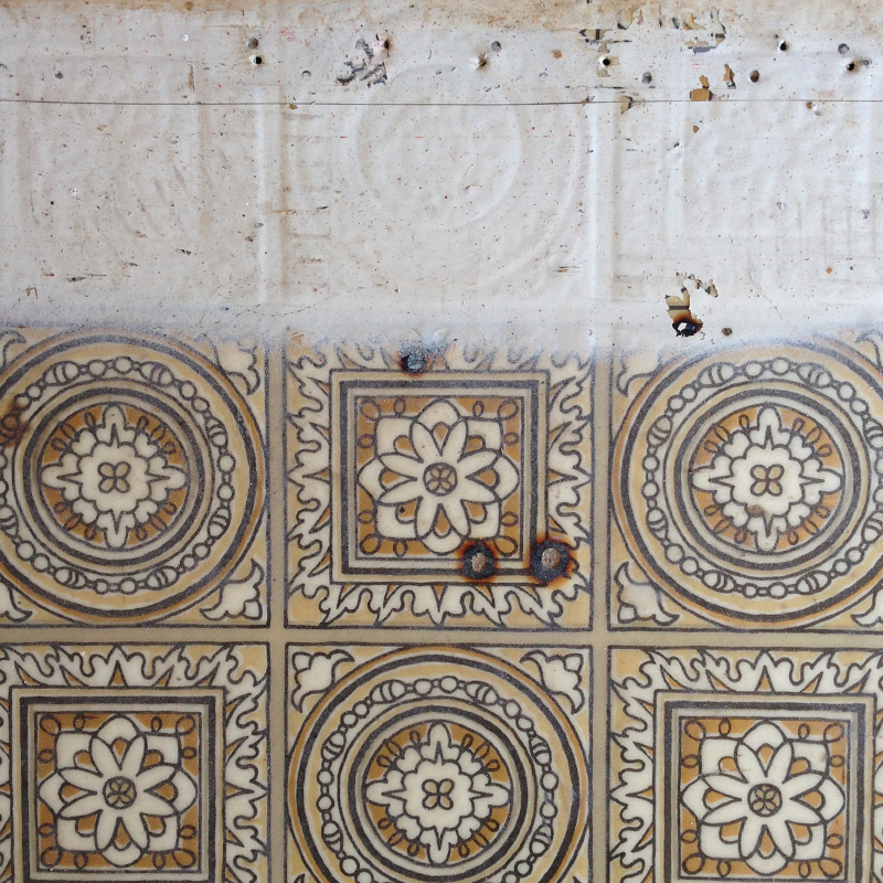
Downside is, we revealed this 70s linoleum. I’m surprised how many people say they like this. Guess it has a certain retro authenticity. To quash visitors enthusiasm, we’d show them these cigarette burns, and paint overspray (which I’ve since scrubbed off). We’re eager to get rid.
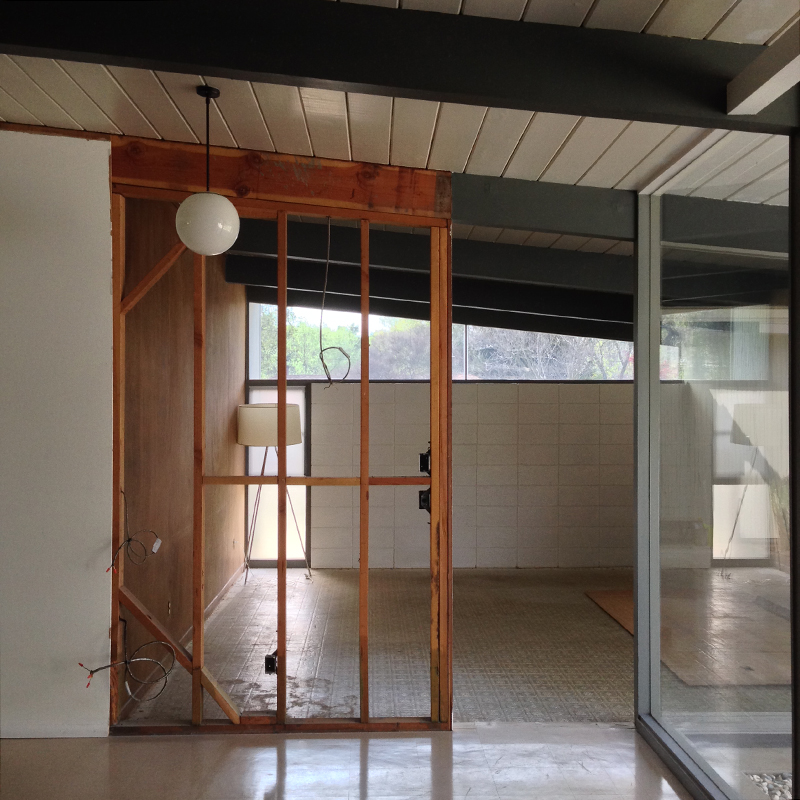
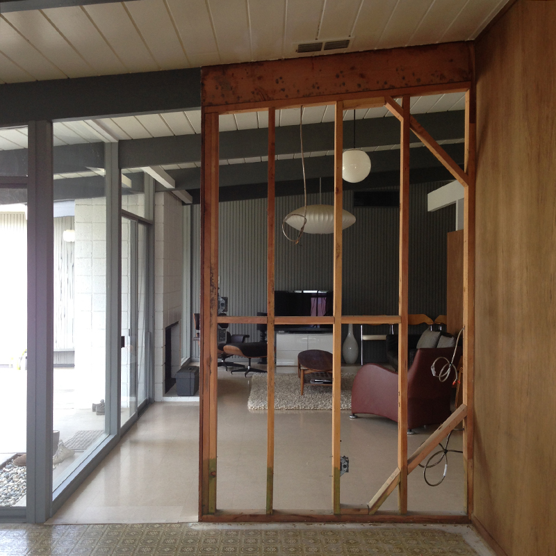
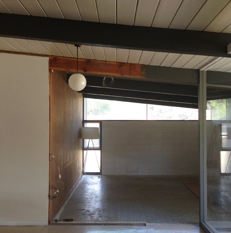
But right now, we had bigger fish to fry. We couldn’t put it off any longer –we tackled the wall. First, we removed the paneling from both sides. This didn’t take long, and we were quickly back to the studs. Now we got a sense of how things would open up.
I’d always figured we’d gain light to the living room, and views into the AP room, but not views back out. Until now. At this point, we were pretty excited. We were also aware that we could still turn back, if we changed our minds. But we weren’t about to do that. We pressed on.
And the wall was down in no time. Literally, Karen went for a cup of tea, and I’d pretty much finished demo. Next, just the simple task of re-routing the electrical. I jest. Luckily, our resident electrician (AKA Karen) is deadly serious about her work. And she did a great job.
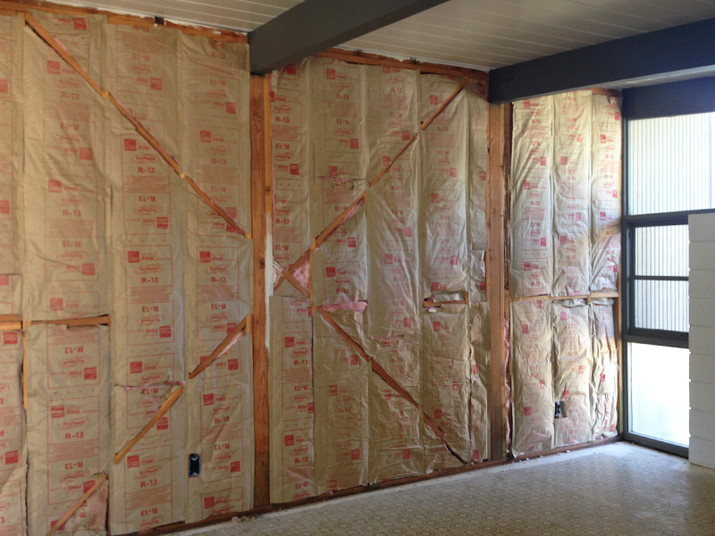
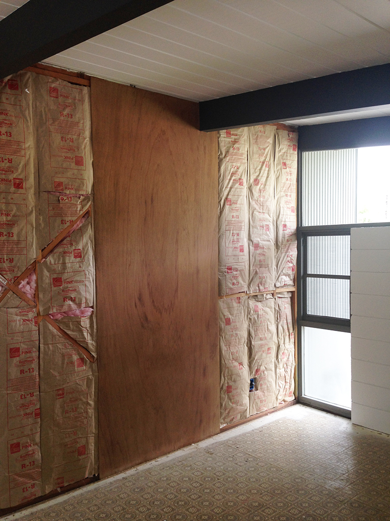
We removed the remaining paneling, baseboards and trim, enabling me to sand and re-finish everything. With that off, we insulated this wall, which backs onto our garage. Unlike our master, there was no insulation here, which was actually a relief –we knew adding some would improve efficiency.
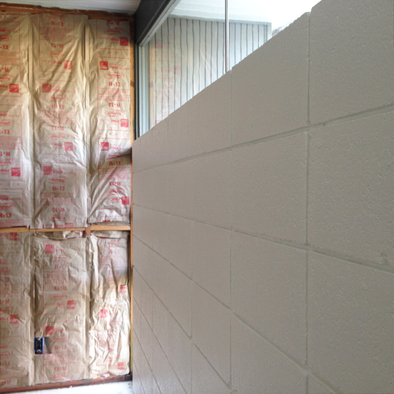
Next, we began the painting phase, starting with cinder-block. As usual, we used Behr Premium Plus Ultra, but this time in semi-gloss –having previously painted this in matte, we concluded it looks better (to us) with a little sheen.
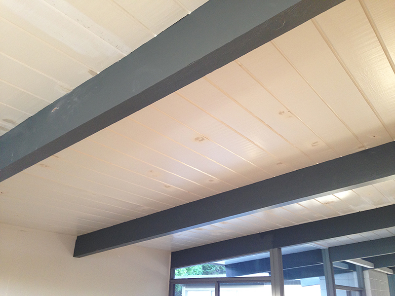
Next, we transformed the ceilings from our ubiquitous off-white, to ‘white-white’. Some patching required here and there. We also had to repaint the beams, as they’re in our old (lighter) gray. The previously covered section of beam (in the distance) needed extra attention –more sanding, filling, and bondo-ing– having been covered for 60 years.
On the living room side, we had to remove and shorten the top trim, having exposed more of the beam. Obviously it’s not painted here, but you get the idea.
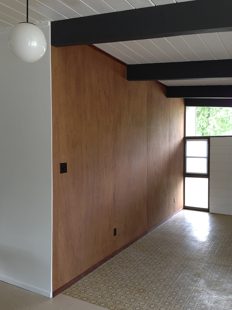
Next, we re-installed the paneling –time-consuming, but not too difficult…until we reached where the wall used to be.
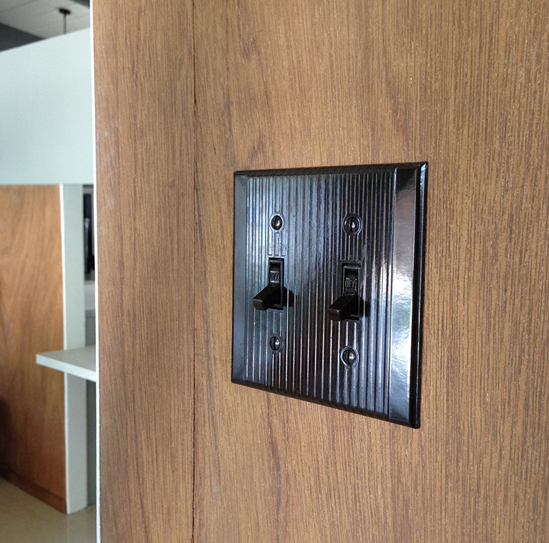
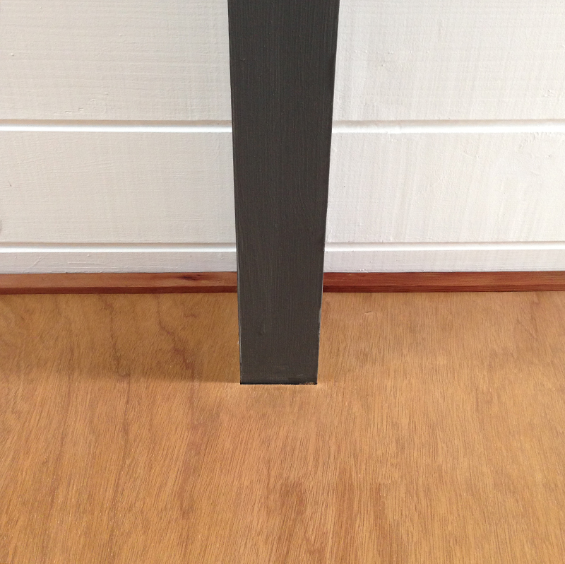
Obviously, the wall had left a gap. We measured several times, then cut a long thin strip to fit. You can see the join line, clearly, but it came out pretty well. We also bought an original bakelite double switch plate, to replace the two switches (either side of the wall) that we’d removed.
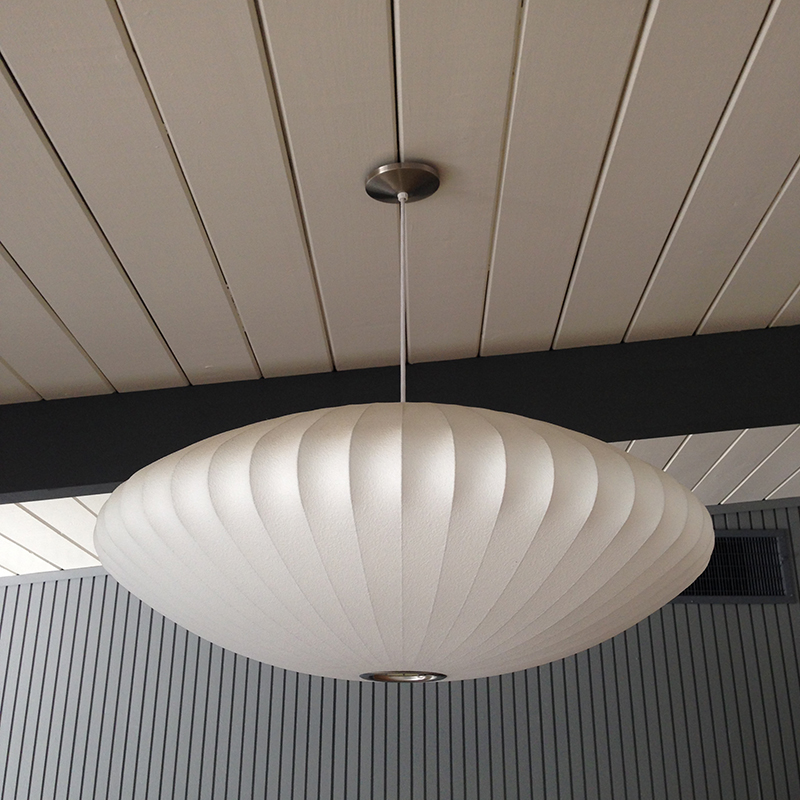
As a bonus, while sorting the electrical, we ran some to our Nelson saucer –previously, this had been just for show. We managed to tuck the electrical wire into a ceiling groove, so it’s completely hidden. One downside –the saucer and nearby globe run off the same switch. But it’s progress.
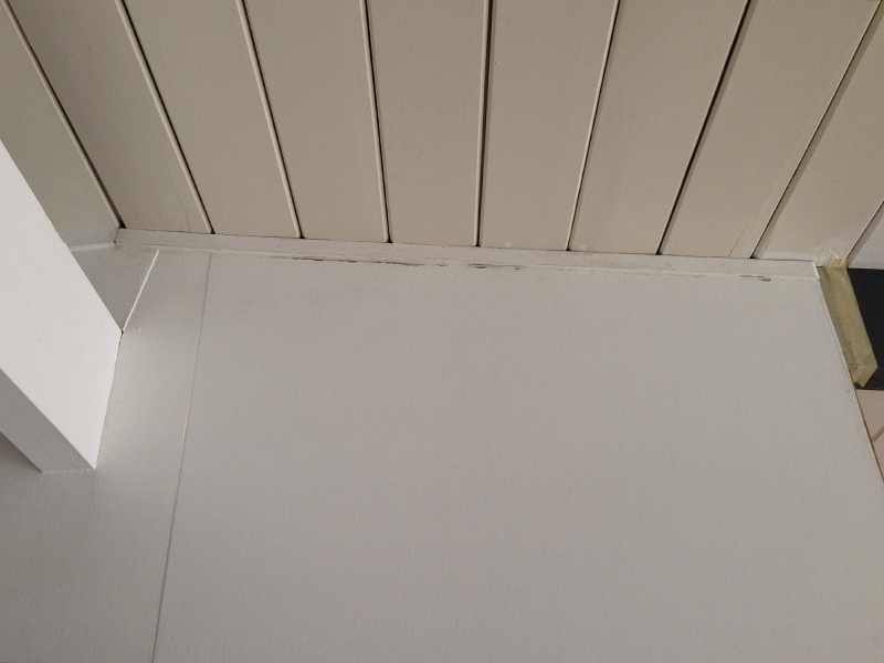
We refinished the baseboards and top-trim, and installed them on the paneling. Funny, this section of tongue-and-groove has been caulked at some point (unlike the rest of our ceilings) presumably because of a water issue. I’m still in two minds whether I prefer this look.
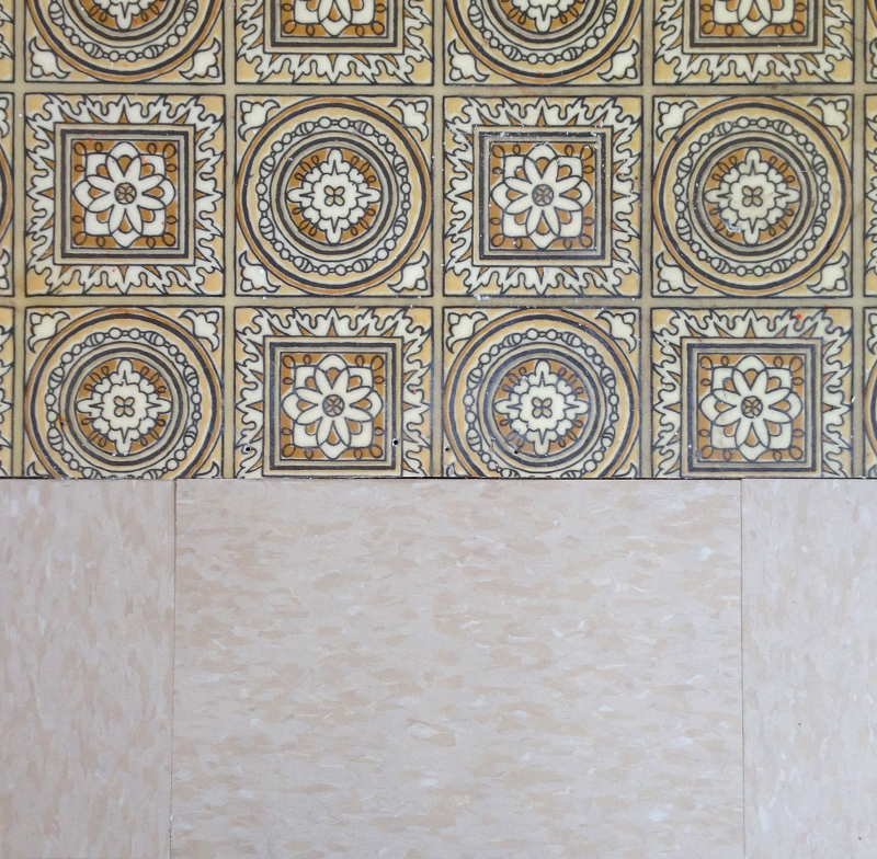
We also patched the floor, where the wall used to be. Luckily, we had some beige VCT in the garage (left by the previous owner). This came out pretty well, and provides a nice flat surface/transition, prior to us installing our final VCT.
This is a big project, so I’m splitting it into two parts (as you no doubt guessed). Sorry, no big reveal yet. We’ll leave it there, with three surfaces done –this wall, the cinder-block, and the ceiling. Next, we’ll move onto the right-hand wall, and the business of turning this into our TV room.
Just one more thing (as Columbo would say) –having made this change, we’ve been nervous about revealing it. Feels hypocritical, as we fly the flag for maintaining original details. Hopefully you can understand this was the right decision for us, and not one we took lightly. Back soon with what happened next…

John
Did you consider adding skylights over the living rm ceiling? How about a large mirror to reflect light into the room. They also make solartubes that reflect down a tube to a small circular opening.
fogmodern
Hey John. We did consider a skylight, but I don’t like the patch of light they create on the floor, and how they interrupt the lines of the ceiling. Solar tubes could work, I guess. We do plan on adding those in our dark corridor, but not sure they’d look right here.
In any case, either option means penetrating our (relatively new) foam roof, and that makes me nervous. We’ll wait ’til just before it’s re-coated to do anything like that. As for a large mirror, there is no suitable wall and I really don’t think it would look good, anyhow.
This seemed the best route for us, with the benefit of adding nice green views from the living room (out through the clerestories) plus a view back from the AP room. It also opens up our living space, making it feel much larger. This will be more evident from my “part two” post, later this week.
Having said all this, thanks for your input! We do appreciate it.
Michelle Jenson
Great work! I look forward to seeing the rest. We are blessed with our house being angled so wonderfully. We get west sun but it’s angled enough it doesn’t blast into our windows and melt us, and even though we have narrow windows, and not that many (I think we have 10 or so windows in our whole house, we get a lot of light. It’s amazing what natural light does to a house.
fogmodern
Thanks Michelle! Yeah, natural light is everything. Having seen the building permit for our place, it looks like they were planning to build a different (smaller) model, which could explain why the orientation is off. Anyway, pleased you got lucky with your home…speaking of which, looking forward to your painting progress. Good luck!
Brooke
I think it looks great! I understand feeling a bit bad about not keeping the original esthetic/layout but I don’t think the change is big enough to ruin the original intent and feel of the home. It works to improve the light and the flow which works for you. I think some of us get stuck in preserving too much without taking into account how we use our homes has changed from the 50/60s. Don’t get me wrong though I think the homes were very well designed to begin with. I’m looking forward to seeing the finished room!
For your wood paneling, I know you’ve stripped and use restor-a-finish but did you use anything over top of the Howard’s like a poly with UV protection or anything like that? I only live in a 60’s bungalow (I wish we had Eichlers in Canada) and I’m adding in some teak wood paneling to our bedroom. I’ve oiled the wood so it’s a beautiful colour but I’m wondering if I need to poly it to protect it more or if leaving it as just oiled wood would be good enough. Any advice? Your master bedroom reveal on Apartment Therapy really inspired me to bring more MCM character to my bedroom.
fogmodern
Hi Brooke! Glad you like it. Yeah, that’s our feeling too. Anyway, reinstating the wall would be easy (if someone really wanted to) as these homes are constructed so simply. And I agree, they were very well designed. The only failing with ours is the lot position.
Regarding wood paneling, I think you’ll probably be fine just with the oil. I’m no expert though. We applied Howard’s Feed-N-Wax after staining, and this seems to be commonly used. I think it’s recommended that you apply every year or so –you could always do that, down the line.
So pleased you were inspired by our AT feature! I’m sure your bungalow will turn out great. This is the first house we’ve owned that truly reflects our taste (difficult to find anything like this in England too!) but we’ve previously applied our style to an 1850s townhouse and a 1980s new-build…and a few in-between!
Catch you soon…
Brooke
I have Howard’s Feed n Wax at home for furniture refinishing but I wasn’t sure about using it on the walls. Thank you for the quick reply and suggestion. I’ll give it a try tonight.
fogmodern
You are welcome, Brooke, anytime.
Brooke
The Howard’s feed n wax worked great! Thank you again for the recommendation.
Can I ask a strange question? I’m planning on adding beams to my dining/living room to get more of a MCM feel and I was wondering if you could tell me the dimensions of the beams in your house? What width and thickness are they and how far apart are they from each other?
Thanks so much and I understand if you’re too busy to reply.
Can’t wait to see what else you guys do in your home.
fogmodern
Hi again Brooke. You are welcome –glad it worked out. Eichler beams are not consistent from model to model, and sometimes there are even two types within the house. That said, they are all (to my knowledge) 4″ thick, at least in building terms –the actual measurement is a little under that. The beam depth typically ranges from about 9.5″ to 11.5″. Most of ours are the lower end of that scale, then the central beam at the top end (and larger still inside the garage). If I were you, I would aim for something in the middle. Spacing can vary too, but I would say that 6′ is typical. Hope that helps! Andy 🙂
Brooke
I really appreciate you taking the time to answer my beam question. Since we don’t have any Eichlers (or really an other true MCM post & beam homes) to visit where I live (Calgary) the info is very helpful as it will help me figure out proper scale for my “fake” beams etc. I never would have guessed they were 4′ thick from most of the photos I’ve seen. Thank you!
fogmodern
My pleasure, Brooke. As I said, the true measurement is less than four inches –I just measured an easily accessible beam, here in my office, and it’s closer to 3.5 inches. It’s probably called a 10 x 4 beam in the trade but (from previous experience) the actual measurements are usually different. I just wanted to clarify that. Do let us know how you get on.
Pingback: open house (part two) | fogmodern
Olivia
This looks amazing! I love that Karen is so confident with electrical work — we are so hesitant to mess with ours (and it IS a mess!). Side note, I missed a bunch of your posts because only one sentence was coming up in my feed (Feedly) with no link to “see more”. Now that I realize that I’ll be sure to click over, but before I was just scrolling right on by!
fogmodern
Thanks Olivia! Yes, we are lucky to have an electrician on our ‘team’ –Karen has done a great job getting to know the intricacies of the US system, which is different to the UK. Thanks for spotting the ‘glitch’ with the feed –I use feedly too, as it happens. I will investigate…
Pingback: truly open eichler | fogmodern
Pingback: table turning | fogmodern