living room
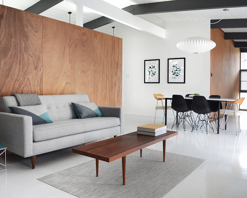
Point the camera in the right direction (as we try to) and our Eichler could almost pass for finished. In truth, we have a long way to go. But we are calling our living room ‘done’. We just completed our flooring install –last on a long list of projects. As a result, we’re not wearing shoes in here yet…and may not ever.
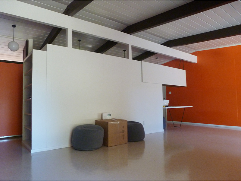
Before I share the process, check out these pics from our first day here; August 31, 2013. The walls/ceiling, beams and floor looked worse in reality –more cream, brown and beige, respectively. Perhaps the vibrant orange had a color-muting effect. But it was clean and very livable…once our furniture arrived.
Here’s a look the other way –apologies for the drunken camera angle. I don’t think I was actually drunk at this point. Giddy with excitement, maybe. Since then, we’ve tackled every inch of this space. For all the details, see our living area posts. Back here, I’ll give you the abridged version…
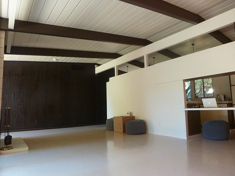
We started by eliminating the orange. Nothing against orange, in moderation, but this was too much for us. So, we repainted that wall white, and restored wood paneling in both living and ‘all-purpose’ rooms. We also painted beams, trim and the siding wall, not once, but twice…and that wouldn’t be the last time.
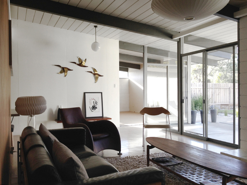
We continued to tweak, here and there, but the next significant step was removing the wall between living and all-purpose room –the one with the ducks on, above. Our toughest decision to-date, but probably my favorite outcome –connecting these two areas, while adding much-needed light.
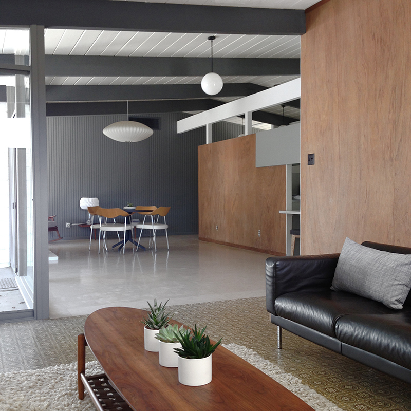
But it did highlight this brown linoleum/beige VCT flooring transition. So we fixed that next, installing “Polar White” VCT, directly over the top –encapsulating potential asbestos, and eclipsing the 1970s. It looked so good, but we had to pause there, sadly.
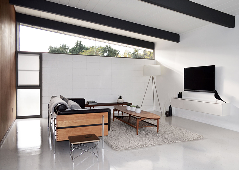
More projects in the living room first, starting with another difficult decision. After 18 months of agonizing back-and-forth, we removed our ‘flying coffin’ cabinet and hairpin table –to accommodate dining, and improve flow between kitchen and living room. This also meant rebuilding part of the dividing wall.
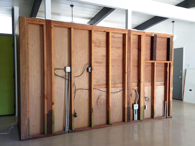
Before replacing our restored wood paneling, we painted the room –a BIG job. Ceiling in our ubiquitous ultra-white, beams in our custom-mix dark gray –we’d already painted these, then tweaked our color choice, making this a frustrating (but very necessary) re-do…
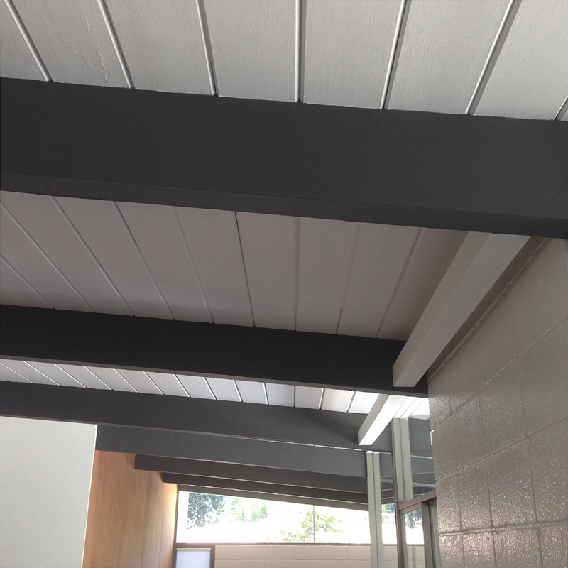
…as was the trim and siding wall (both painted in our initial gray paint selection). This was the third time we (well, Karen) had painted this wall. You can see the grays are actually pretty different. And our first two selections both looked very blue outside. Hence the switch.
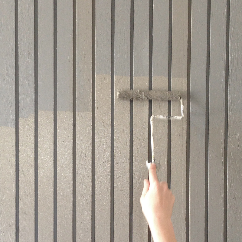
Because the siding extends from inside to out, it needs to match. Even if 90% of people wouldn’t have noticed the color difference, we’d know. And I’d likely point it out, as I’m inclined to do. Anyhow, now it does match. Along with the window trim…and all is right with the world.
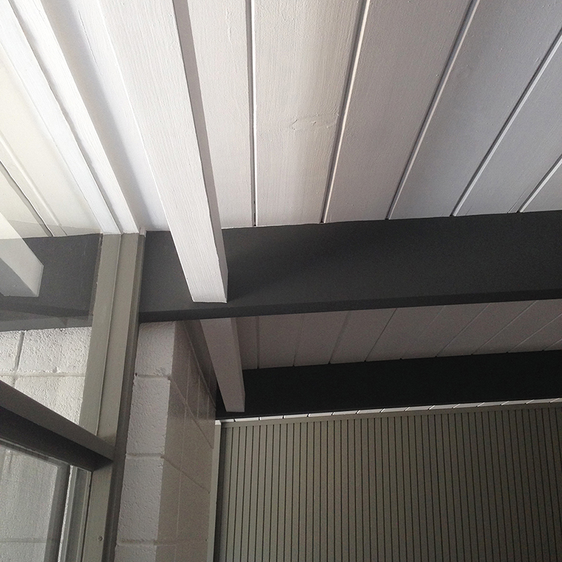
With that done, finally flooring time. First, we dry-laid tiles from the TV room, to the far siding wall, and across to the kitchen. I was paranoid that the tiles may go off-line during the 25-foot span –thankfully not.
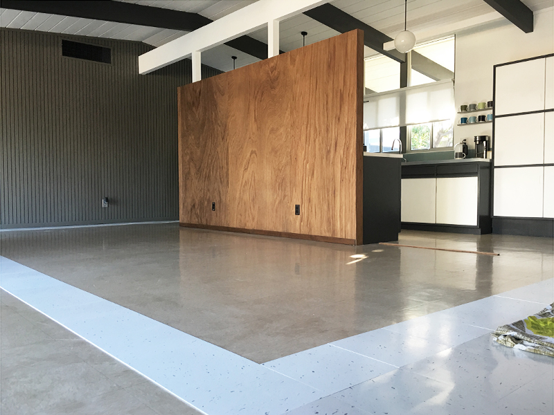
Next, we cleared the room, removed the baseboards, and cleaned the floor. Then we applied adhesive, waited for its semi-translucent state, and got to work. We laid directly over the existing beige VCT –a great, flat surface, and a good guide to maintain straight lines.
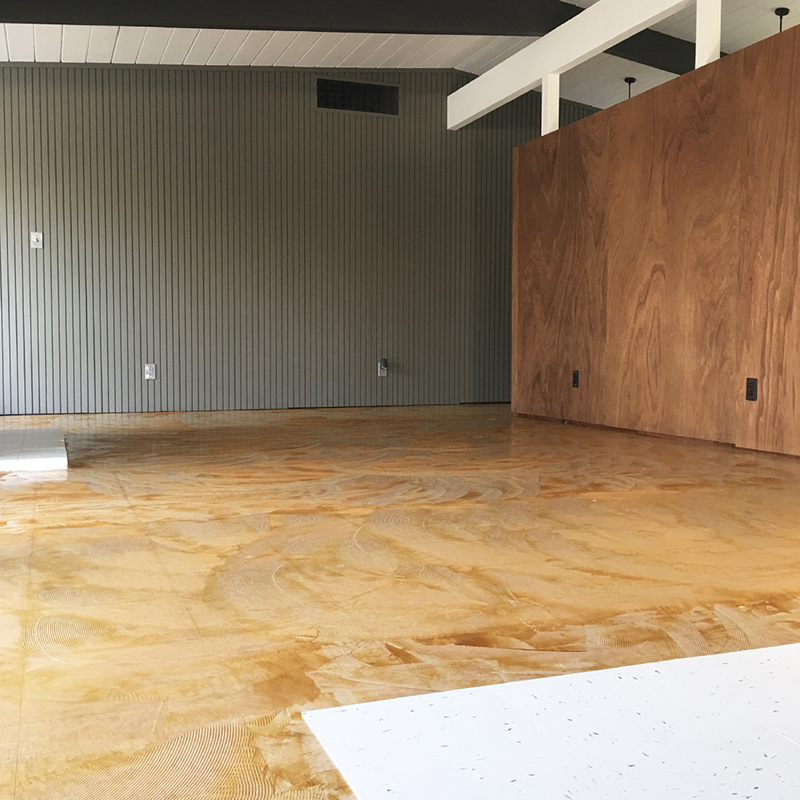
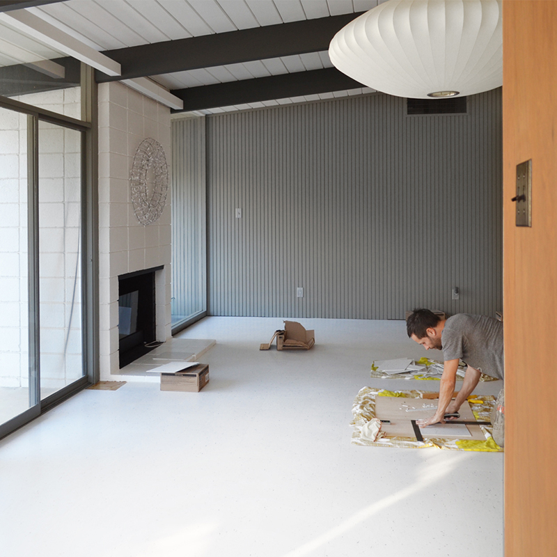
I’ll skip the details, as we’ve been here before. Suffice to say, the whole thing took a while, as we tried (and inevitably failed) to achieve perfection. Here’s my (not so) pro tile-cutting set up, sneakily captured by Karen. Not pictured is her hair dryer, used for complex cuts. Like I say, pro.
With the VCT in-place, we applied the usual two coats of sealer, plus four coats (and one for luck) of polish (this stuff). The original baseboards were so battered, we replaced them with this Home Depot close match. We painted before install, then caulked and touched-up in-situ. This is obviously pre-paint.
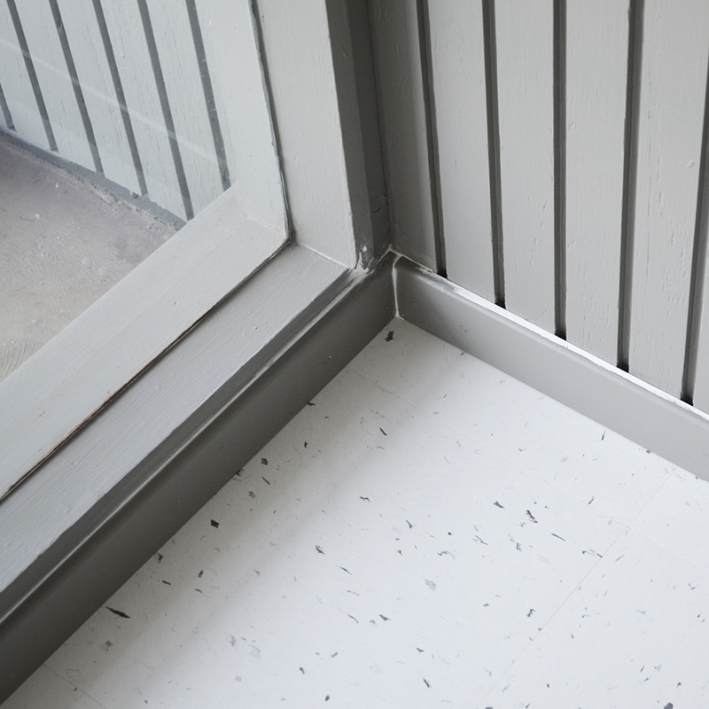
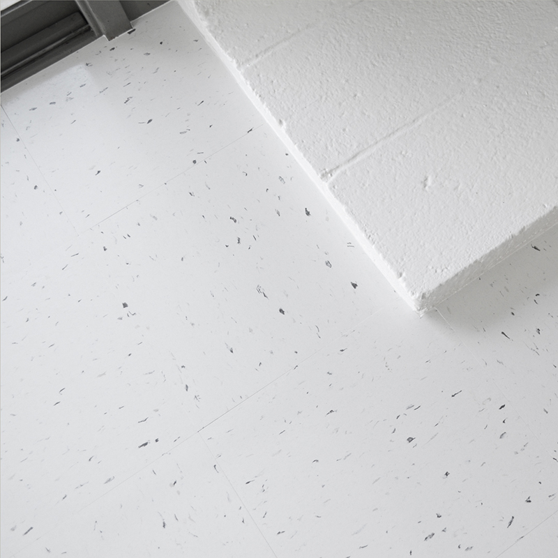
Where there aren’t baseboards, we made tile cuts precise, then caulked any remaining gaps. We’re not pro floor installers, so we accept it will never be 100% perfect. Honestly though, it’s way better than the previous VCT install, which definitely wasn’t DIY. We’re very happy.
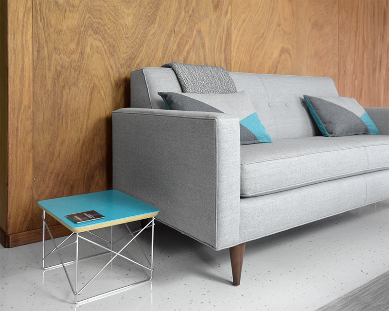
We waited three long days before moving furniture in. We’ll switch that dresser for a true credenza, but we’ll keep the rest. The sofa is the 73″ Bantam, from Design Within Reach –we wanted something compact, so we could center it to the fireplace (opposite) and still have room for side tables.
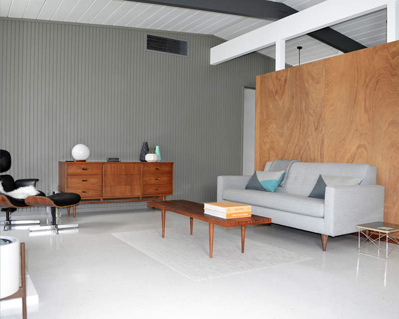
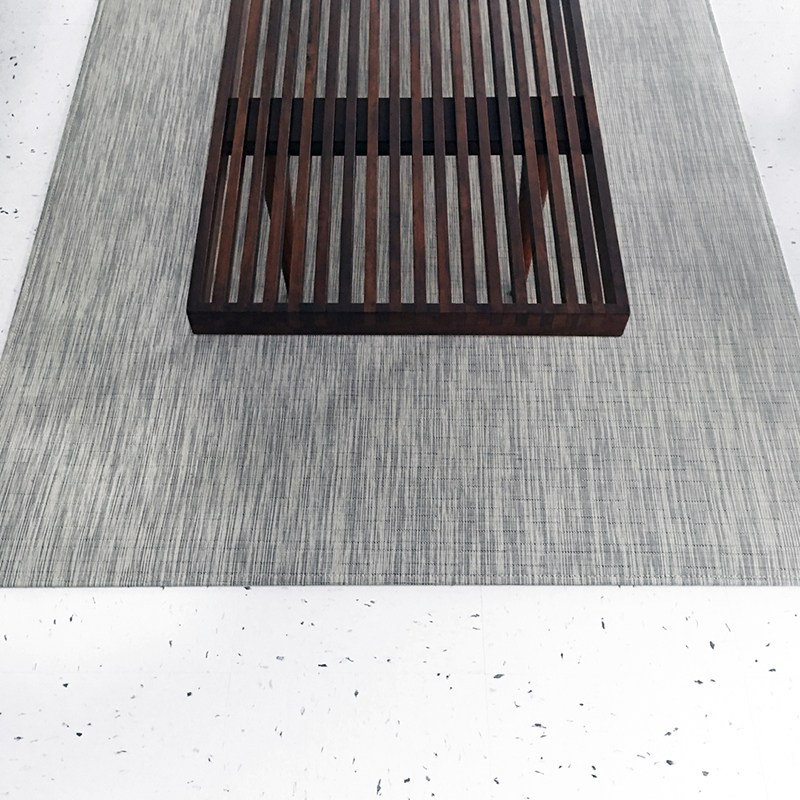
We had been searching for a coffee table, then realized this vintage bench (we already had) was perfect. It’s sitting on a (Christmas gift) woven floor mat, from Chilewich. I know, we could’ve picked something more colorful, but we like these soothing tones.
And we did add some color. This mini wire side table (just discontinued) is from Modernica. We designed the pillows, sourced the fabric, and had them made by our seamstress –a perk of running your own bedding business. The coaster (also in blue, yellow and white) is the Skyscraper series, from MoMA.
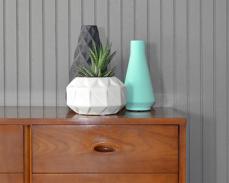
On the dresser/credenza, ceramics from CB2 –a long-time favorite of ours. We have a second white planter elsewhere –one arrived chipped, and they kindly replaced without fuss. The vases were Christmas sale buys, like $10 each or something. We love the texture and color.
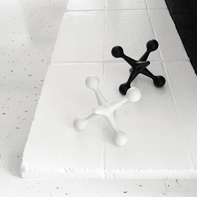
We couldn’t resist adding our cast iron ‘jax’ (formerly in our office) as they’re a perfect match for our (even more) monochrome palette. These were a beautiful and kind gift (about a year ago) from our friend, and Concord Eichler owner, Camila. If you want your own, they’re available from her Etsy store.
Our Modernica Case Study planter also looks at home here. We need a floor lamp, to fill the spot to the right of the sofa. And I’d like another chair (LCW or LCM) by the fireplace…though Karen’s not convinced.
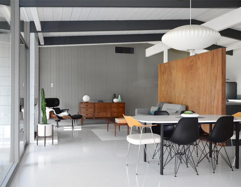
But we definitely agree on one thing; we love our new living room. With the flooring transition gone, the rooms flow together, and seem visually ‘right’. If you could spin round, you’d see the kitchen/entrance flooring is still beige –like I say, all about where you point the camera.
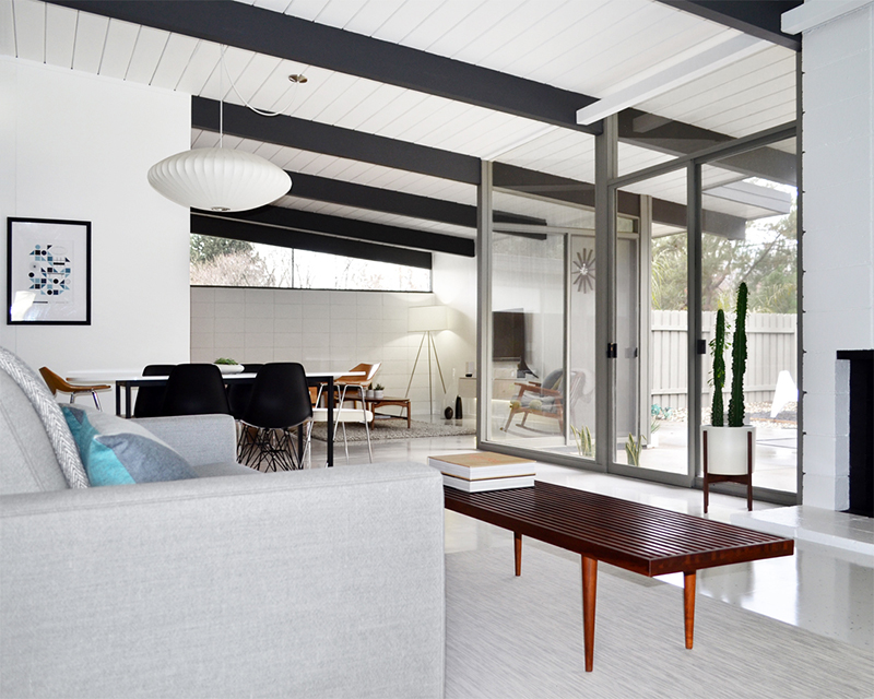
Sometimes it feels like our renovation will never end (much like this post). And maybe it won’t. Truthfully, I’m not sure what we’ll do with ourselves if/when we do finish. Happily, we won’t have to ponder that for a while. Either way, it does feel like things are coming together. More soon…

Brooke
It looks absolutely stunning! There’s no doubt the removal of the wall and coffin really make the space and having the flooring now match really brings the rooms together. lol I’m sorry for teasing you both for the lack of colour, it really looks great with the accents you’ve added in. Love it!
Brooke
I forgot to ask, when it’s dark out does the nelson bubble lamp provide enough light for your dining area; is there just one bulb or multiple bulbs in it? I’m trying to pick something new for our dining room and I’m torn between a bubble light, a sputnik or a Serge Mouille style spider ceiling light
fogmodern
Thanks Brooke, so pleased you like. No problem for the teasing! I grew up on a steady diet of sarcasm, but (as I said via Facebook) I’ve adjusted to speaking more literally since moving to the US. People already have trouble understanding us, so it’s not advisable to throw sarcasm into the mix. Glad you like our minimal color accents!
Oh, and the Nelson does give off enough light. We have a single 60W (equivalent) LED in there. It’s not super-bright, but I like the warm glow, and it feels right for dining. I imagine the Sputnik or Spider would throw out a lot more light, so it’s just down to personal preference. Look forward to seeing what you pick.
Beth
Looks so great! I have an idea for when you’re done: come do my house! We have a modern house in your fair city that was last updated in the 90s….Beige, shaker style, you get the picture…everywhere!
fogmodern
Hi Beth! Now that IS an idea –haha! In all seriousness, we’d love to do other people’s houses too…but just can’t get our heads around that concept right now, with so much left on our own ‘to do’ list! Cool you live in Sac too. Feel free to drop us an email –we’d love to see some pics of your place. Catch you soon…
tony
Hi Andy. What a transformation – but why did it take you so long?! (just a little teasing from me). It looks so light and airy and pristine. i don’t think anyone should be allowed to wear shoes in there. As to what you might do when you have both finished renovating, maybe re-painting the Golden Gate Bridge in Grey and White with a one inch brush. Seriously though, you have done a great job in such a short time. Very well done.
fogmodern
Haha! Spoken like a true Englishman –very funny. We have a much smaller (yellow) bridge here in Sac that we could work on! Seriously though, glad you like what we’ve done and thanks for your kind words and support.
John
Looks great! Time to call Atomic Ranch to do an article on your place.
fogmodern
Thanks John! Not quite yet –still plenty to do off-camera!
Lisa and Kyle
Definitely looks like the cover of “Atomic Ranch” next issue! Lovely!
fogmodern
I think it will be a while. One day maybe. But thanks!
Pingback: looking back: 2016 | fogmodern
Pingback: the right gray | fogmodern