green room
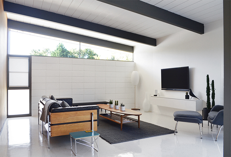
Since we ‘finished’ our TV room (is anything ever really finished?) we’ve had a nagging doubt that it needed something more. With white ceiling, wall, flooring, and cinder-block, it just felt too white, even for us. We considered replacing some of the right-hand wall with glass, and we still might, but we wanted a quicker, easier medium-term fix, to break-up the white overload.
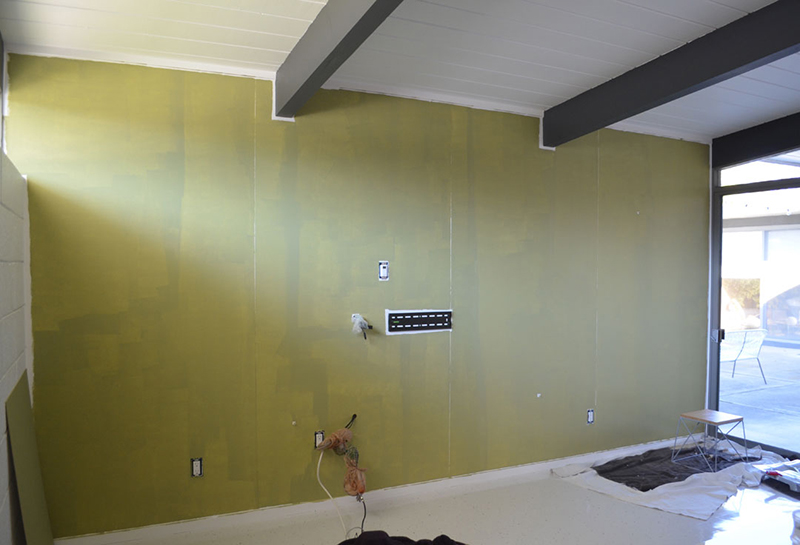
We figured painting the TV wall would provide some much-needed color, while contrasting with the other white surfaces. Our palette is deliberately small, and we didn’t want to extend it, so we tried our door color: Behr’s “Fresh Olive” –we painted a small board first (visible on the left) before tackling the wall. First though, we de-cabled and removed the TV/cabinet –no small task.
Obviously we added more coats, and painted the trim, but there are no more ‘during’ shots –you know what they say about watching paint dry, right? So, let’s get to the ‘afters’. For us, mission accomplished. Our only concern was that it may be too much color. Now it’s done, this shade of green feels just right (to us) and naturally ties into the rest of our scheme.
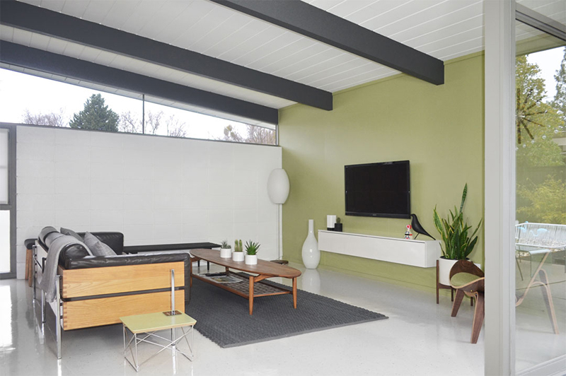
We moved a couple of pieces around, to celebrate our accomplishment. Clearly our nomadic Shell Chair is a good color match, but we will likely move that back to the master, where you’ll notice there’s now a gap (in the distance, below). So many chairs, so many corners, lots of options. We feel lucky.
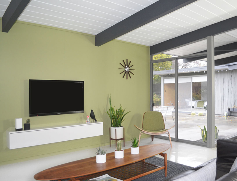
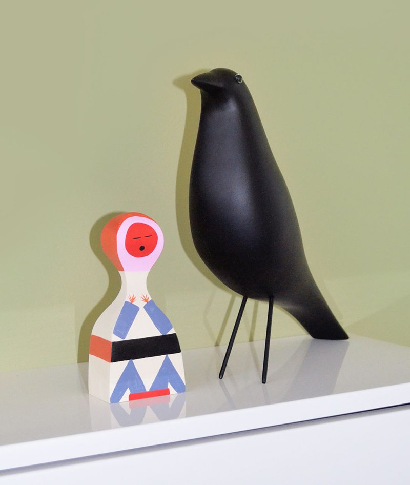
Talking of which, we’re also lucky to get another new addition –this fabulous Wooden Doll, designed by Alexander Girard, in 1952, and made by Vitra. This was a super-generous (and unexpected) gift from our good friends at Lumens Light and Living. Thanks SO much guys, we love it!
Mike (our snake plant) needs to move back to his living room corner, and Colin (our cactus) has now taken root in our master bedroom, so I’m thinking we need another Case Study planter for this spot. You can never have too many, within reason. Love how our clock looks against the green backdrop too.
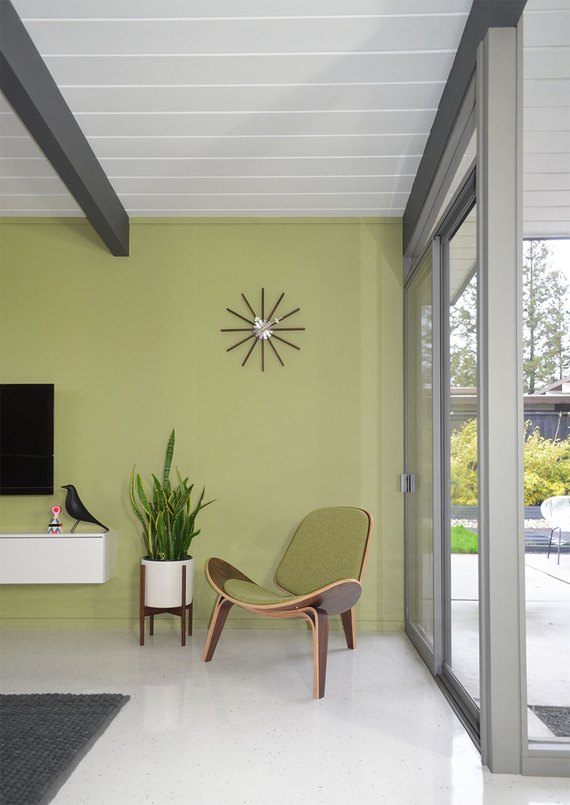
Truthfully, it’ll take us a while to adjust, but we’re enjoying the added color so far, particularly in this current bout of gloomy weather. And it feels good to make a positive change to begin 2017 –a year we hope will be great for us, and for you. Hope you like our first new year project. More on the way…

John
Pretty gaudy for you two! I think it looks great, and really warms up the space. The color is consistent too…
Andy
Haha! Yeah, I guess it is, John! I’m sure people weren’t expecting it. Anyway, glad you like it. It really does make the TV room feel more cozy, which is how it should be.
tony
Hi Andy. Looks great. The shade of green is perfect – classy and subdued but with just the right amount of added colour. Love the new doll too – reminiscent of the Russian Dolls in design (can’t remember what they are called). Super start to 2017.
Andy
Hi Tony! Glad you like the shade. It feels just right to us. You mean the nesting dolls? I believe they are called “matryoshkas”. Either way, we love the addition –such a great gift.
C
You know, I am not sure that I interpret Eichler being as muted as you do. The stark white floors feel so sterile to me and this green feels really watered down (kind of like the Erdal’s staging of the sunnyvale eichlers). Did you consider a brighter color?
Andy
I totally get that some people may find this look stark, sterile, or muted. To us, it feels minimal, clean and tranquil. It’s all down to personal taste. The beauty of these homes (in our opinion) is the blank canvas they provide. We just choose to retain more blank than most. That said, we have reinstated four walls (so far) of wood paneling, which do add warmth. But we appreciate that some people crave more varied and brighter colors. That’s just not our style.
John
Much better! The contrast plays up the plant stands and wall cabinet. Nice to lose the architect Richard Meier look.
Andy
Thanks John! We do like the contrast the wall creates, with objects and adjoining surfaces. And yes, a little too white before, even for us…though probably not for Richard Meier!
Amy Moore
Love the color!
Andy
Thank you, Amy! Pleased you like the new color!
Mark
Hi Andy. I’ve been stalking your site for awhile — really enjoy your posts. I notice the side table has changed color. Maybe you can share how this was done? Thank you for sharing your home.
Andy
Hi Mark! Thanks for stalking! Glad you enjoy our posts. Well spotted on the side table! We actually have four (in blue/gray/mustard/green) so we just switched them around to best complement our scheme.
Mark
Andy, that makes good sense. It’s nice to watch you grow with your color palette. Like you, I enjoy moving things around a bit. That blue table may do well to circle back one day, as it appears it could be complimented by the new green wall. Best to you.
Andy
Thanks Mark! Yes, we like to start white/neutral and add accents from there –that said, we’re not big on color, as you can tell! We are forever re-arranging and editing. It keeps things interesting! Thanks again for following, and catch you soon…