on the move
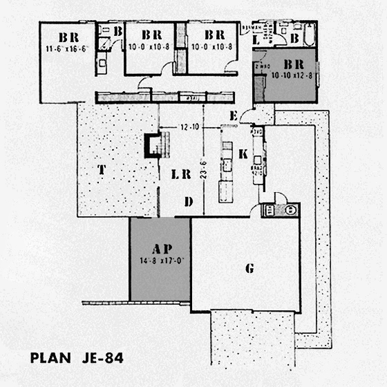
Don’t panic, we’re not going anywhere. But our office has –we’ve moved it about 40 feet, from our ‘all-purpose room’ (bottom-left) to our second bedroom (top-right). A much better fit for for us.
Here’s how it looked last time I showed you. This room will become our new TV room, considerably extending our living space. We’re working on it right now, with some big changes underway. I’ll do my best to catch you up here soon.
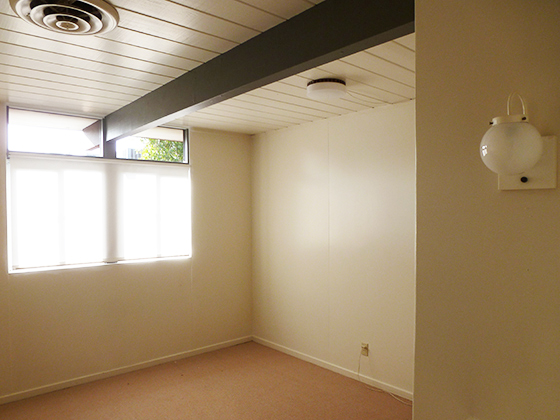
Before that, the new office. This was our guest room, at the end of 2013, then our photography studio, almost a year later. For dramatic effect, here’s how it looked early on.
Everything –ceilings, walls, drawers, door– had been sprayed off-white, as per the rest of the house. All we’d done to this point was add a roll-up blind and paint the beam.
Fast-forward, we removed the beige carpet and installed VCT. We painted the walls, ceiling, drawers and closet –and that’s where we had an issue. The only suitable place for our desks was the gray wall, but that would mean butting them up against the closet.
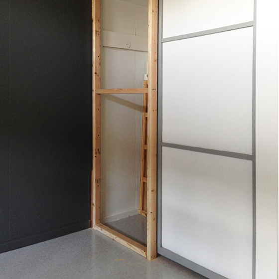
Not gonna work. We had an idea. We’d block up the door nearest the wall, still allowing storage access from the other, but providing an adjacent wall for the desks. We removed and stored the door (in case we ever want to reinstate it) and framed the wall.
It needed to be solid, but not ultra permanent. First, we faced it in luan, but the veneer split in a couple of spots during painting. So, we added thicker ply over the top, giving a smoother finish and more strength.
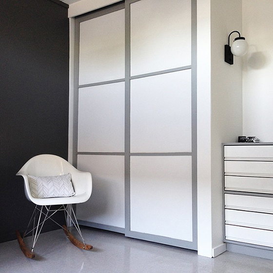
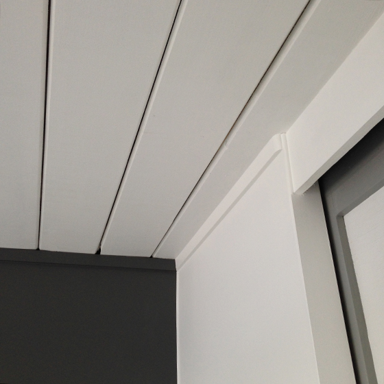
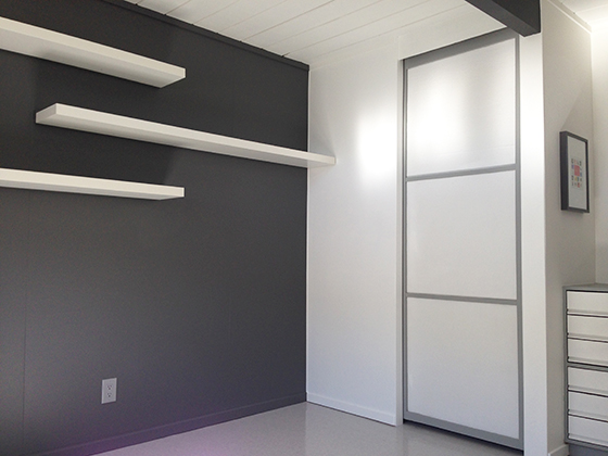
We wanted the wall to look authentic, so we added top trim from inside another closet, and baseboard that closely matches the original. Then we painted the wall. The remaining closet door now slides behind it.
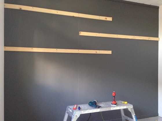
Next, we added some shelves on the gray wall, above where are desks would go. We picked white IKEA LACK shelves. They needed to support a decent amount of weight, so we screwed additional supports into the existing studs.
We fixed supplied IKEA brackets into the supports, painted everything the same gray as the wall, then slotted the shelves into place.
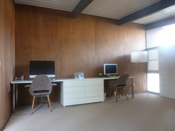
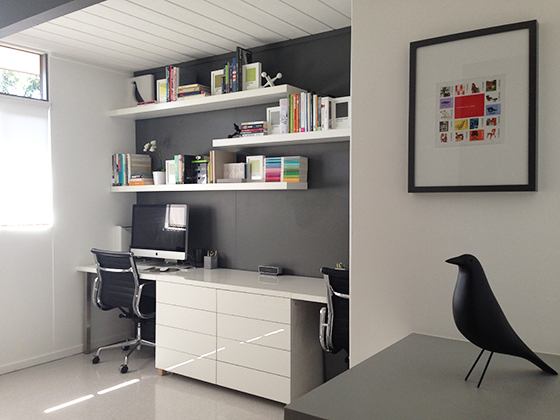
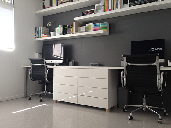
Next, we installed our desktop and drawers, transferred from our former office. We had to remove about 10 inches from each end to fit, but it now runs wall-to-wall, which we like. We filled the shelves with stuff too. Instagram folks should recognize the Eames stamps.
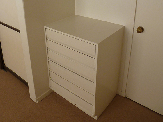
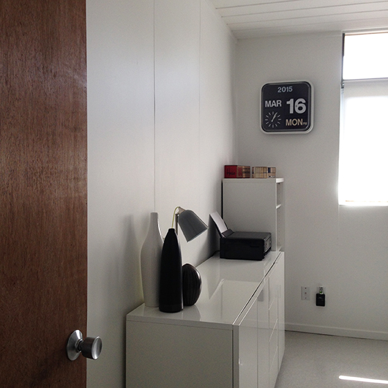
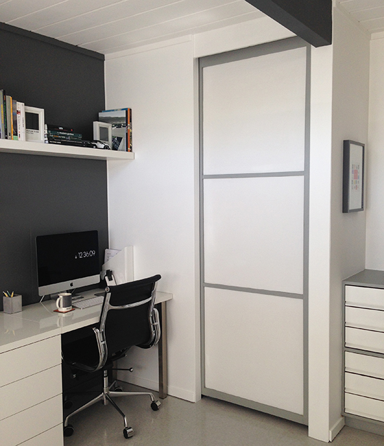
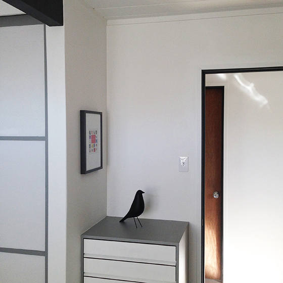
Backing-up, here’s the view when you enter the room. We re-faced this door and added hardware. We moved our long storage cabinet here, and also found a good spot for our flip-clock.
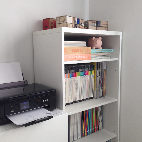
That blank wall to the left will eventually house a Stendig Calendar –we left it too late to get one last year, but we’re on the list this time around. We added a basic bookcase in the corner, for heavy magazines etc, and sat our Eames House Blocks on the top.
Spinning around, here’s the corner I work in. You can see how the desktop fits nicely against the wall we created. On the right, the original built-in provides more useful storage.
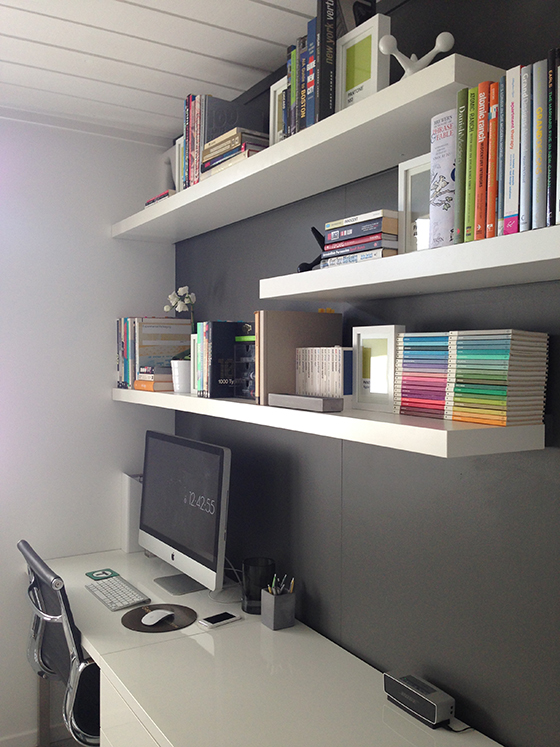
Here’s a look at Karen’s corner. She does the real work, so gets a bigger screen than me.
We didn’t put a ton of books on these shelves –partly because we wanted space for things to breathe…and partly because we were afraid they’d collapse. I jest –they do feel very solid.
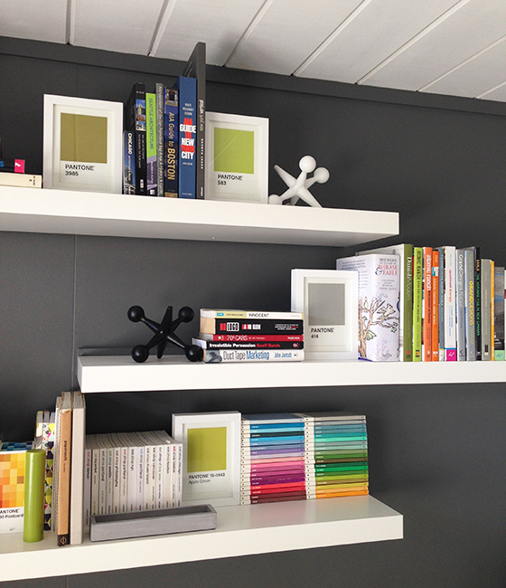
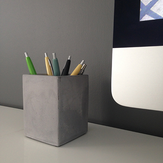
We framed PANTONE postcards and used these as bookends. We picked our favorite grays and greens, but can always substitute colors if we feel like it. With our office move complete, we treated ourselves to some ‘concrete’ pen pots, to celebrate.
Inside, retro pens we bought nearly three years back, as I shared here –Karen said she’d wait ’til our office was sorted before using hers. She did, but I’m sure she didn’t plan on waiting this long. Here’s the view out to the corridor.
We still need to add a white strip below the desk drawers, to cover the wooden feet we attached. Oh, and new VCT flooring. And some lighting. But it’s pretty much done. We LOVE our new office.

Karolina
Is the inside of your door frame painted to match the beam? Loving all the details here.
fogmodern
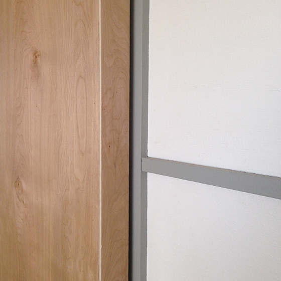
Yes, it is. We did try sanding everything down and going natural, but they just came out really red, and the finish was pretty poor. Our early model doesn’t have the flush no-trim door frames, like later Eichlers, but we still wanted to create a sleeker look. Once we’d painted the door jamb, we replaced the battered old trim with lower profile trim. We like the way the gray picks up the beam color, while contrasting with the white trim and wood door. Pleased you like the details 🙂
Pingback: flooring flip-flop « fogmodern
Pingback: no-purpose room | fogmodern
Pingback: photo finish – fogmodern
Wendy
I am interested in the make of your office chairs and if they are working out for you? I have had problems with the last two chairs we have bought. Thanks for your help.
Wendy
Andy
The chairs are holding up just fine, thanks. They are Eames Management Chair reproductions. Pretty cheap to begin with, but we also got a great deal locally, from Kardiel. They no longer sell them, but there are many alternatives. It’s a bit of a lottery though, regarding quality. Sorry I can’t give you another recommended source.