kitchen refresh
Last summer, we completed ‘phase one’ of our kitchen makeover. It was a BIG improvement (unless you love tiled countertops) but we were never 100% happy, and didn’t post a final reveal. Recently, we undertook what we’re calling a ‘refresh’ –fixing functionality, and re-doing stuff that didn’t quite work out. And here’s where we’re at now…
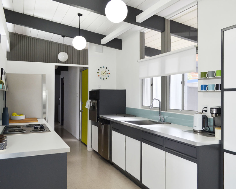
We’re still not finished (will we ever truly be?) but we’ve come a long way. To show you how far, let’s take a look back –here’s our kitchen in September 2013, just after we moved in (check the “new home” cards). It’s not pretty…except for the refrigerator, which arrived the day after we got the keys.
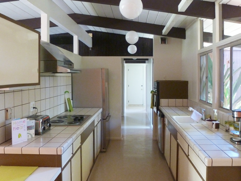
Nine months’ later, phase one –we ripped out tile and replaced with laminate counters, removed the ugly range hood, replaced the (painted!) sink, and faucet, added Formica backsplash, and painted cabinets, doors, drawers, and walls. Much better, I hope you’ll agree. After that, we took a deep breath.
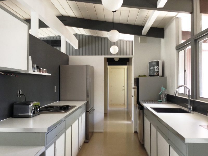
Another year on, more tweaking. First, we agonized over removing the flying coffin/table –tough decision, but the right one for us. Next, the backsplash –we’d picked thin Formica which came rolled, and never lost its memory, making it pull-away from the caulk. We also didn’t love the color –things always look different scaled-up, from a swatch. So we switched it, for this painted acrylic…
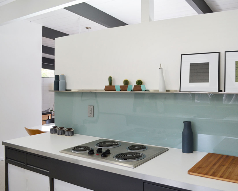
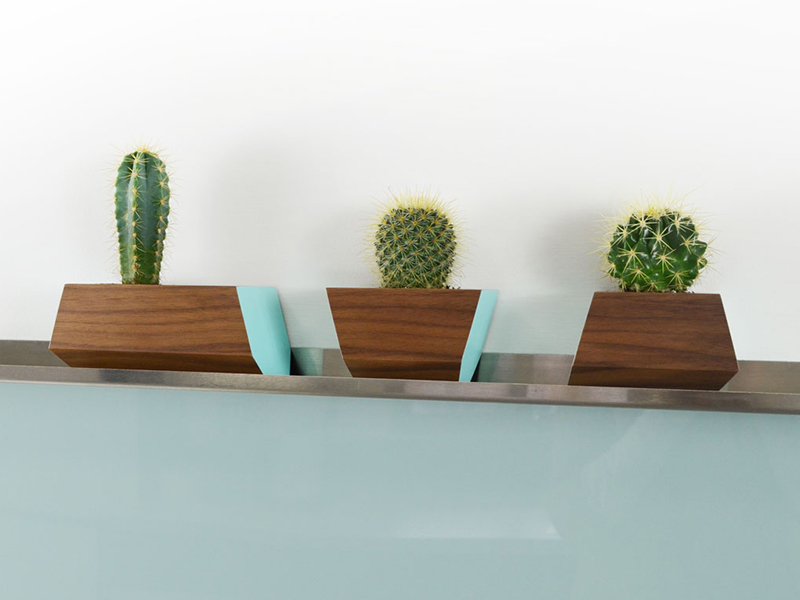
We LOVE how it turned out (click for install details). We painted the wall behind it white, for contrast, and added a stainless-steel ledge above it, mainly to display pretty things –speaking of which, we just bought these stunning boxcar planters, in solid walnut and robin egg blue. We’re in love. Also the perfect excuse for more cacti…like we need one.
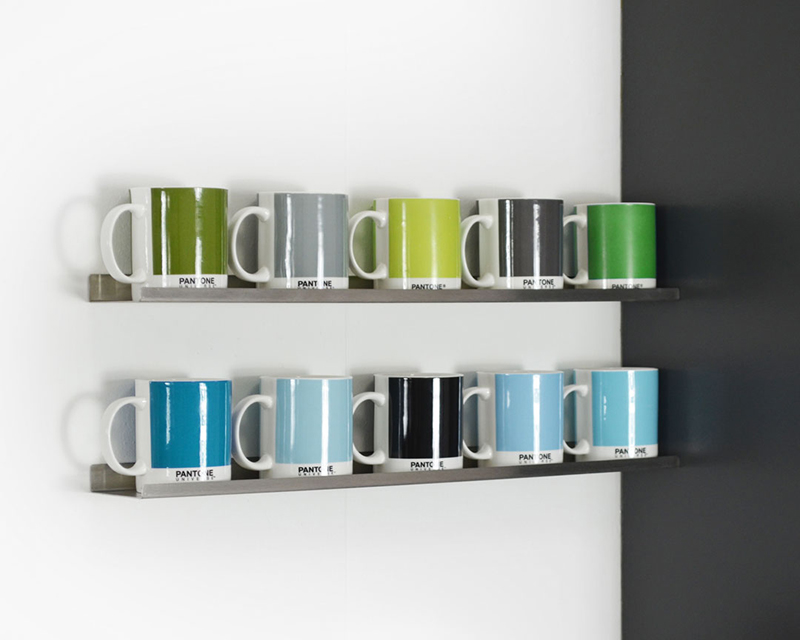
We added two matching stainless steel ledges on the opposite side, above our tea and coffee area. These indulge our PANTONE fetish (yes, we have a problem) with both devoted to our mug collection.
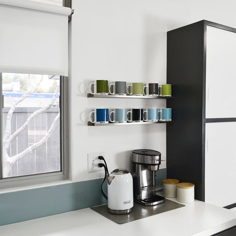
We have many more in the cupboard, collected over several years. We did buy some additional mugs to fit our kitchen palette…and played around with color combinations for longer than I care to admit.
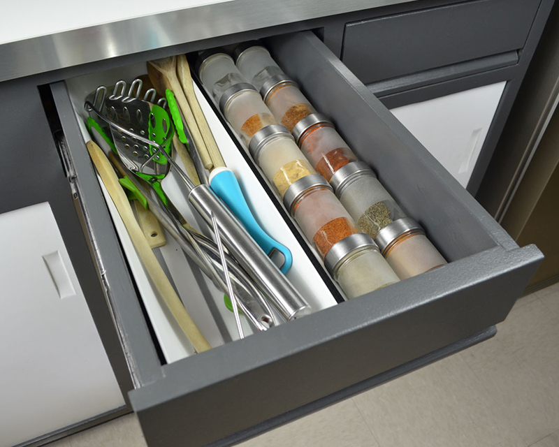
But it’s not all for show –we also improved functionality in a few places. We added IKEA staples like drawer liners, spice jars and trays, to make everything feel newer and better organized –that said, this drawer could do with some sorting…but you get the idea.
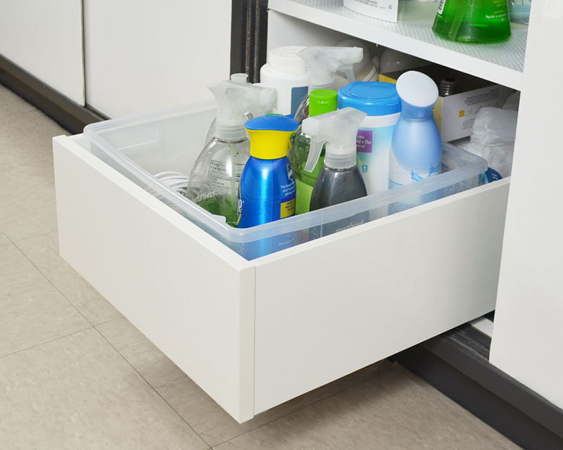
We also added soft-close drawers, inside a few cabinets, to make cleaning products etc. more accessible.
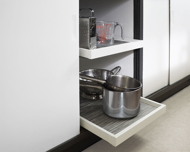
And my personal favorite (as I do most of the cooking) soft-close shelves, for pots and pans. We had to cut them down to fit (trickier than we hoped) but now they work like a dream. We lined the shelves with spare placemats, as they happened to fit perfectly.
But perhaps the biggest change was repainting the cabinets. We were never convinced by the mid-gray color we originally picked and painted (see third pic) and the finish wasn’t holding up too well –perfect excuse for a color change…which has become our specialty.
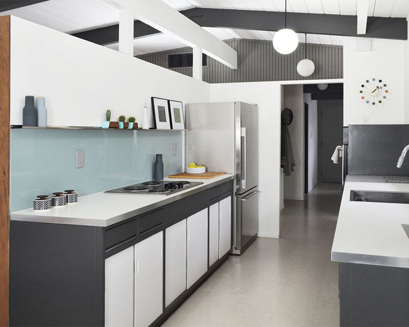
This time (I think) we got it right, using our dark gray (custom mix) beam color. It’s a much stronger contrast, which we love. And we think the darker color looks more authentic, somehow. I believe the cabinets were originally black (or close) Zolatone, though I’m happy to be corrected.
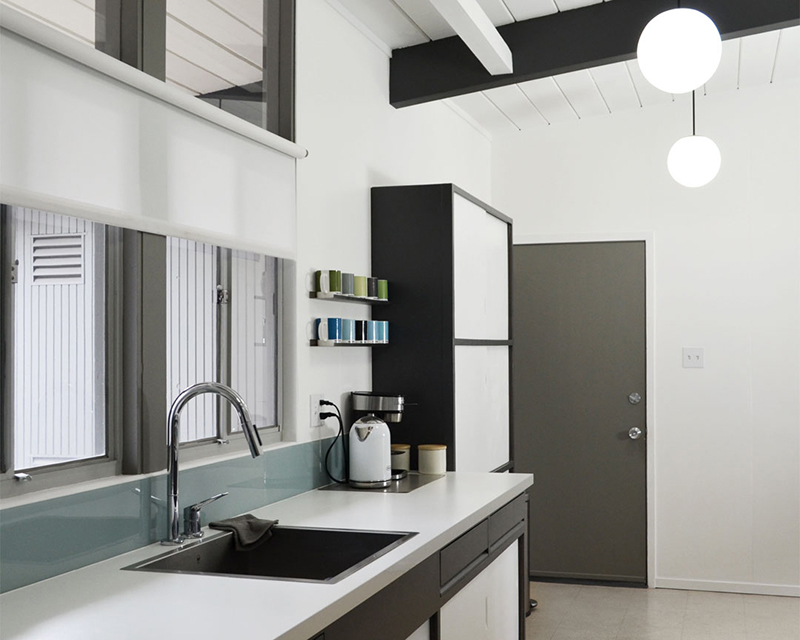
And that’s that. We need to add/replace stuff on the long shelf, switch-out the appliances eventually, and replace counters in the long-term. Oh, and install our new white VCT flooring. For now though, we’re very happy. And we’re enjoying our kitchen more than ever. We hope you like the changes.

tony
Hi Andy. What a stunning array of mugs along the shelves, and I really love those planters with the cacti. The whole kitchen has been transformed. It really has the “wow” factor. Talent and hard work is a great combination. Very well done.
fogmodern
You really are too kind, Tony…but we’ll take it! Glad you like the transformation. We are very pleased with how it’s coming together.
Ivy
Fantastic! Incredible how a few changes make such a huge visual impact!!! And kudos for keeping the cabinets but altering the interior for more modern function. You and Karen continue to inspire and impress me.
fogmodern
Thanks Ivy! We’re surprised how much better the kitchen feels and functions, following these simple changes. We love the look of the original cabinets, so wouldn’t want to lose them. So glad you find some inspiration in what we do!
John
The darker gray makes everything pop, increases the contrast, nice change.
fogmodern
Thanks John, we agree. Shame we didn’t get the color right first time, but we got there eventually.
Keisha
Love it. Such inspiration for my kitchen, that I can tackle a refresh without gutting the whole thing and starting anew.
fogmodern
Hey Keisha –awesome, I’m glad to hear it provides some inspiration. For us, it was a balance of retaining the original feel, while somehow making it feel shiny and new…or as new as a 60-year-old kitchen can feel! Good luck with yours!
Jackie Seybert
I love the soft close drawers! Such a great idea. We have original 1961 cabinets and that would be a nice upgrade 🙂
fogmodern
Hey Jackie! Glad you like the drawers. These were Karen’s idea –I was skeptical at first, but they do work well, and make the kitchen more usable. They also make it feel newer, somehow.
Melissa Arnold
I love the changes and hope to implement some of the same types when we take possession of our 1961 mid century modern home in March. Can you share which inserts you used in your cabinets for the pots? And how you went about altering them to fit your cabinets? Great job!
fogmodern
Hi Melissa, glad you like the changes. So exciting that you’re getting your own MCM home! Everything is from IKEA’s Komplement range: http://tinyurl.com/otqknhq We reduced the shelf width by dismantling, cutting, then re-attaching. They honestly don’t look perfect close-up but work well. We had to drill extra holes in the drawer runners, to attach them to the cabinet floor. A little work, but well worth it. Let me know if you have any other questions.
Nora
Beautiful! Could you tell me where you bought the long stainless steel shelf? Thank you!
fogmodern
Thanks Nora! The shelf is from Ultra Ledge: http://www.ultraledge.com/ –they make numerous sizes and colors. Our two smaller shelves opposite are from the same source. We’re very happy with them.
Nora
Thank you so much! They even have the length I need!
fogmodern
You are so welcome, Nora. Glad to hear that!
ultraLEDGE
Thank you, FOGMODERN, for doing such a wonderful job showcasing our ledges. There is very little MCM in sunny Charlotte, NC and our design team spent the entire morning drooling over the photos of your house :). Best, ultraLEDGE.
Andy
You are SO welcome! We love your ledges. The minimal design is a great match for sleek Eichler lines. Wow, we are flattered –so pleased you enjoyed looking at our house! We look forward to our next ledge project. Thanks for stopping by.
Karolina
Oh, so nice. We’re in the middle of stripping the paint off of our original cabinets (a sticky mess), and planning to retrofit the existing Eichler drawers to be soft-close, because they’re slowly but surely wearing out. Did you do that as well?
fogmodern
Thanks Karolina! I would’ve thought you could just sand and repaint the doors, though stripping will probably give you better results. We haven’t yet made the main drawers soft-close, only internal ones. I say “yet” ’cause it’s on our list. Not a priority as they were already fitted with new mechanisms sometime in the past –they work pretty well, but just sound a bit clunky.
Lisa and Kyle
Love everything about this…right down to the colors of the mugs…super amazing transformation…did I say that I love it?! Wow! 🙂 Hard work pays off! 🙂
fogmodern
Aww, thank you! It took us a while to reach this point –and we’re still tweaking! We still have new appliances to get, flooring to install, and (ultimately) we’ll switch-out the counters. But it still feels like we’ve come a long way!
Christopher
Hi,
This is simply wonderful! I was wondering where you got that sink from? I am getting ready to remodel my MCM home, and that sink looks like it would be a cool option! Thanks so much!
Cheers
Andy
Hi Christopher, glad you like it! The sink is a 23 inch stainless steel undermount sink, by Vigo. We just wanted something square, deep and minimal, and this fits the bill. Thanks for your kind words!
Christopher
Also,
The white outlet cover you added in one of your other upgrades. It was the non original one. Not the ceramic, but the one with the single toggle.
Andy
The minimal white plates, without screws in the facing, are available at Home Depot. They don’t do a version for double/triple switches, sadly. We didn’t search too hard though, so you may be able to find something if you need a match.