bonsai butterfly
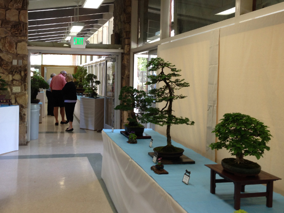
Way back, we visited Sacramento’s Shepard Garden and Art Center…and I’ve finally got round to sharing some pics. Technically, we were there for a bonsai exhibition, with our friends Kelly & G. The bonsai was good, but the building was way better.
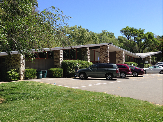
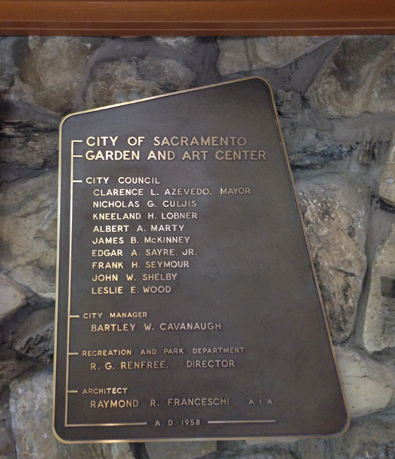
Originally named City of Sacramento Garden & Arts Center, this A-frame/butterfly roof beauty was designed by Raymond R. Franceschi, and built in 1958 –sounds like I’ve done my research; in reality, I just snapped this pic…
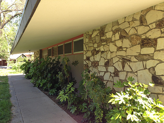
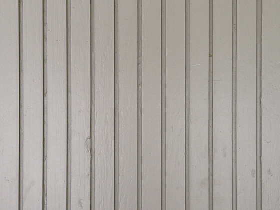
This post-and-beam building looks great from all angles. The exterior is a mix of funky rock and familiar wood siding. I say familiar as it’s identical to the siding on our house –no real surprise, as the Center was built just a few years later.
This ‘wideline’ siding is the same type specified for early Eichlers, like ours. Most later models (I’m guessing >1960) had ‘thinline’ siding (here’s a comparison) and a small number had wider plank T1-11 style siding.
Anyhow, this looks identical to ours. It’s even painted the shade of gray we’d like to achieve (if we can ever resolve our paint-picking woes). And the similarities persist inside. These ceilings look remarkably familiar too, don’t they?
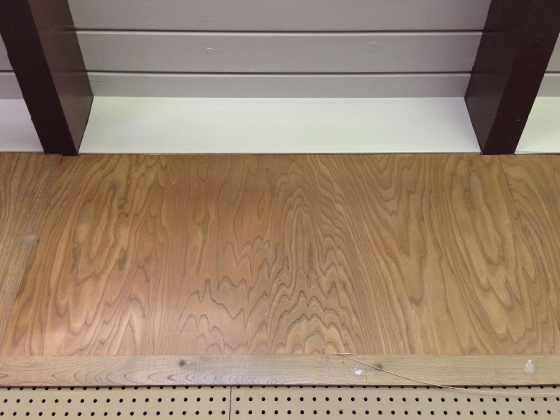
Much as I tried to focus on the exhibition, distraction was everywhere. From vast walls of wood paneling, to abundant clerestory windows. At the heart of the building, a giant flagstone/terrazzo fireplace –I couldn’t get a pic, as it was covered up, but you can see it here.
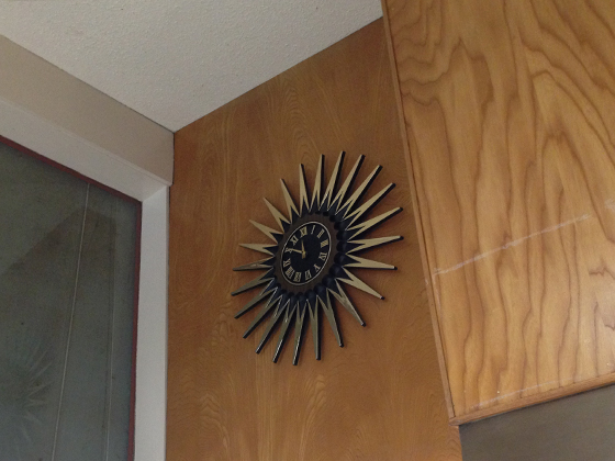
Some drool-worthy decor too. This clock was high up on the wall –probably best to keep it out of temptation’s way. Anyway, it’d look great in our home, despite the Roman numerals, which just don’t do it for me.
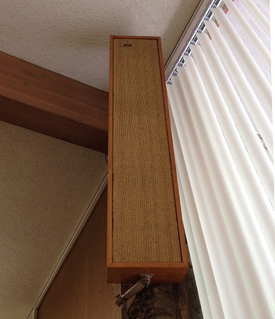
And there’s plenty to love about these gorgeously retro speakers. You can’t judge the scale from this pic but they were huge. We’d struggle to get them in the MINI. Shame about the office-style vertical blinds, but there you go.
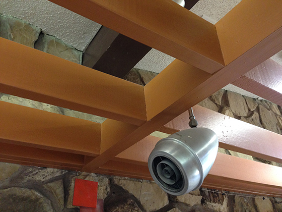
Overall, a wonderful mix of materials, textures and angles. And most of the fixtures look to be original. Check out this silver bullet-shaped beauty, suspended from the lattice-work frame overhead. Nice.
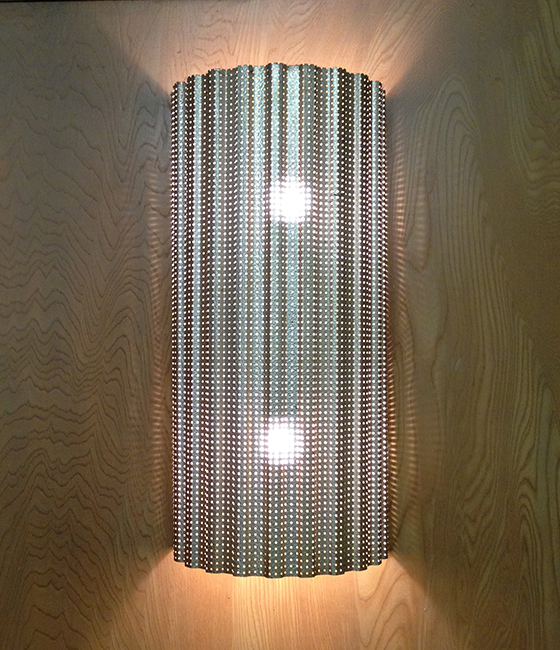
And how about this intricate up/down wall-mounted light? The pic really doesn’t do it justice –it’s just stunning in-person. This was tucked away in a corner, and there were probably more little gems I missed.
In fact, I didn’t capture nearly as many views as I should have –we must go back, and I’d urge any locals to visit. If you’re craving more, check out the picture gallery, on the Shepard Garden and Arts Center website.

