master vanity
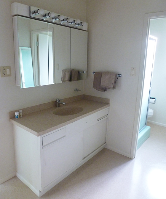
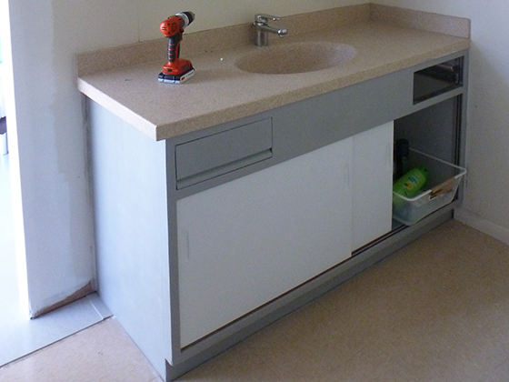
Finally, I get round to sharing our master vanity project. The only original bit we inherited was the vanity itself (though it was sprayed white, like everything else). That stays, along with the non-original faucet. The countertop, mirrored cabinet, and light fixture will all go.
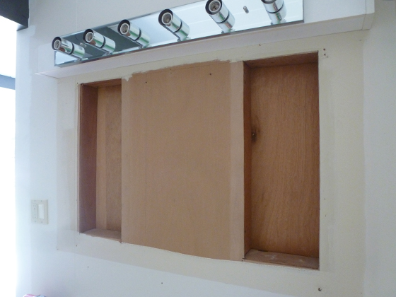
We’ll also add something back in –the medicine cabinet I told you about, kindly donated by our neighbors, Joan & John. It’s original to our model, as the cavities and screw holes prove. Once we reach that point, it will (or should) simply slot into place.
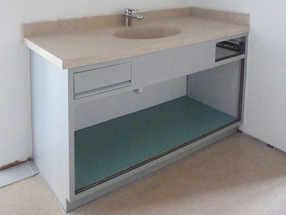
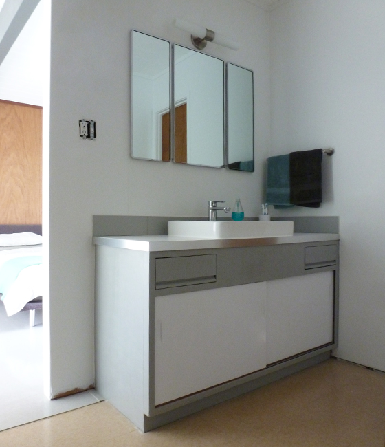
Before all that, we filled, sanded and painted the vanity –gray on the outside, with a contrasting blue interior (to match our master scheme). We gave the drawers the same treatment –we do have two, but one needed fixing, so isn’t pictured.
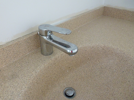
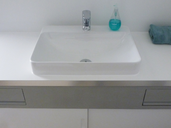
About that faucet. It’s made by Dorn Bracht, and some quick research told us it was expensive. And you can tell –it’s real heavy, with a super-smooth action. Plus it looks great (to us, at least) so it was a quick and easy decision to keep it.
Back to the vanity –we sanded and painted the doors gloss white, masking-off a small strip, top and bottom. This will remain bare wood, and will mostly be hidden in the grooves. The paint on these bits always gets scraped when you slide the door, so it made sense.
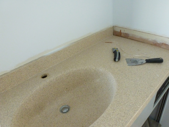
Worth mentioning, our kitchen cabinets are identical to this, and will (ultimately) follow the same color scheme. On top, the existing solid surface isn’t terrible, but it’s well worn and impossible to get clean. We agreed to replace it, further down the line…
…then we got a call from our friends, Kelly & G, bringing our plans forward –they spied some countertops in IKEA clearance, for a steal. Not exactly what we’d have picked, but not far off. And at the price we paid, we’d make it work.
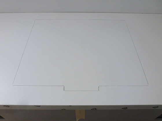
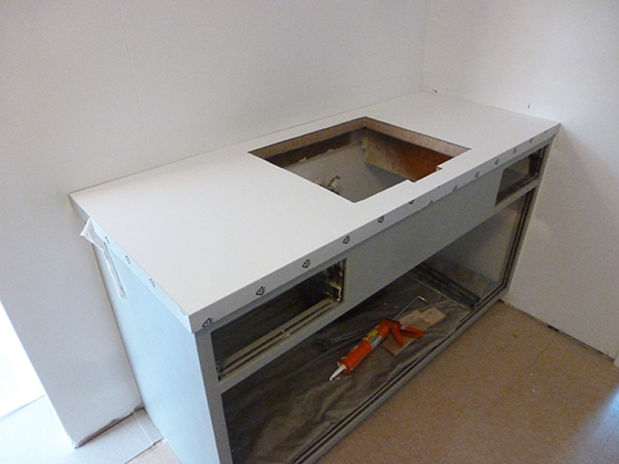
Despite the crazy low cost, the countertop is in perfect condition and extremely solid and heavy. We borrowed a circular saw (thanks Zann & Jeff!) and cut it to size. Then we made the sink cutout with our jigsaw –we do have some tools of our own.
If it were 100% up to me, we’d replicate the original drop-in sink, but Karen prefers a more modern (in the literal sense) look. Our other concern is the low countertop height, so we found a route that addressed both these things. This partially-sunken sink…
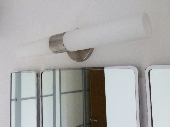
I guess it may date, but we love it right now. It’s so sparkly and clean. And its curves mirror (aptly) the medicine cabinet…which was trickier than expected to install. So much so, I didn’t snap any ‘during’ pics. Here it is, beneath our replacement light fixture.
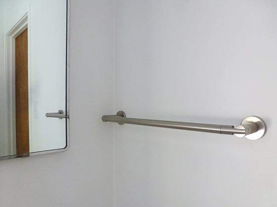
We picked this George Kovacs vanity light –also a bargain, but with zero compromise. We both adore it. Next we added this Gatco towel rail. It took longer to decide where to put it than install it. Predictably, it ended up (pretty much) where the old one was.
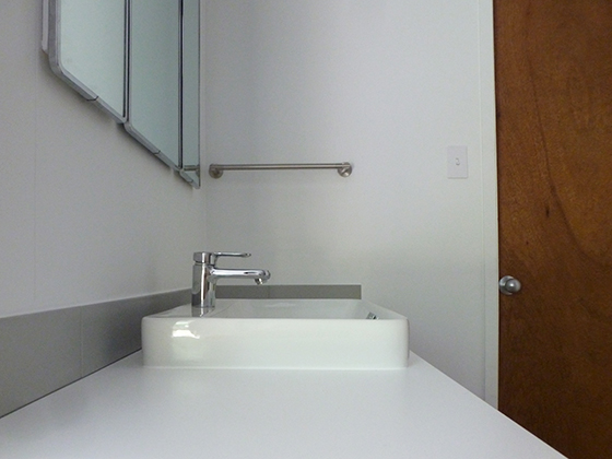
Finally, we added one row of tiles for the backsplash. We used American Olean Light Urban Canvas, in Matte Light Smoke –this is an almost perfect match for our vanity, so it worked out well. We used gray grout and silicone, to avoid too much contrast.
And then we were done…with the exception of the left-hand power outlet/switch. Oh, and the floors of course. And I try not to think about the demolished shower room beyond the door, above. We’ll get to that…eventually.
For now, we’re very happy. It’s another project off the list. And another space made more liveable and more ‘us’. And we spent an obscenely small amount of money in the process. Bags more stuff to share, when I find some posting time…

Olivia
Very nice! I love the light and the sink. You really thought of everything when choosing that sink didn’t you? Solves all your problems!
fogmodern
Thanks Olivia! Glad you approve. It’s funny, I’ve been back and forth on the sink. I was worried it jarred with the original elements (vanity & cabinet). Now everything’s in place, I like it.
Karolina
Love the curves of that medicine cabinet! It’s nice to see original bathroom details like this. Our baths were completely redone before we got our place, but (thankfully) with a very light touch.
fogmodern
I love the curves too, Karolina –we got so lucky, scoring the original medicine cabinet. It’s not all good though. You should see (or not see) our guest bath. Not pretty.
I can’t recall what your baths look like. I guess because they don’t need much attention –”light touch” sounds good though.
I think Karen may have preferred if ours were done. That way they’d be more liveable, and we could make them ultra-modern (as per her taste) with a clear conscience. But I like our old/new blend. It reflects both our tastes.